
Page 109 - The Decorative Painter Winter 2014
P. 109
OIL
sketch lines. Again, because of the thickness of the glass, looking even slightly from the side will offset the design.
COLOR MIXES
To ensure reasonable uniformity in your work, mix enough paint and medium to be used throughout the project. The project requires small amounts of product, but note that any of the formulas may be reused, inter- mixed, or used to highlight along the way. Note: The first two color mixes are used in Steps 1 and 2, and the remain- ing colors are used in the remaining steps.
For shades and highlight colors that are created in Steps 2 through 4, simply add more or less Glazing Medium to any given mix. In the Step-by-Step, you will see the paint- ed color mixes that are used in each step. Use your imagi- nation to create mixes that closely resemble these; they do not have to be exact. You can experiment by intermixing colors until the desired color is achieved. When I mention gray, this is rarely created by adding black. Instead, it is a combination of Ultramarine Blue Deep and Raw Umber, mixed to your liking.
LET’S PAINT
STEP 1: Add a bit of Glazing Medium to Umber-Green. Paint the outlines of the dominant trees, some upper branches, and close-appearing leaves. Add a bit more Glazing Medium to the mix and add lighter-colored twigs and leaves as well as initial shadows to the trunks. To do this, use very little product on the brush, almost using a dry-brush technique. Keep things rather light and trans- parent in this step. Remember that you can always darken in subsequent applications, but you cannot lighten.
STEP 2: Add some lighter leaves in the upper reach- es of some of the trees. Add more leaves and stronger, opaque lines (indicating branches) to the distant trees, and shadowy edges to the trees and brush in the fore- ground. This will make it look as though fog lies be- tween the viewer and the distant trees. Paint in some of the contour lines in the foreground. It may be tempting to push further, but restrain yourself and let the paint
dry until the next day.
STEP 3: Add some lighter (more transparent) leaves, without much detail, as well as an occasional branch that appears as if it’s in the background or small (the white or light gray of the birch or poplar tree trunks). Add a few dominant lines in the bushes and trees in the close distance. Indicate their shadowy shape using combinations of already-mixed glazes. These must be transparent, more so than earlier foliage. Remember, the painting must be transparent to a large degree. This also creates a feeling of distance, and of the bushes and trees fading in the early light.
STEP 4: Enhance the existing trees in the foreground. Complete and embellish the other trees and the foreground. STEP 5: Paint the sky with a very thin, transparent glaze of Sky Blue (it can always be darkened). Paint the glaze right over the leaves. Because the painting will be viewed in reverse, it will appear as if you see the sky through the leaves. Deepen the blue slightly to tone the water in the foreground after you tone the ground here and there.
FINISHING
If you haven’t already, sign your work in reverse in a light and transparent area. A thin coat of varnish is optional.
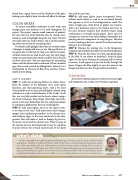
artist’s sketch
Karl-Heinz Meschbach mdp began his apprenticeship at the age of fourteen, under the masters at Berlin’s Hand- werkskammer Chamber of Trades and Painters Guild. He has been a certified professional decorative painter since 1959 and a Master (HC) since 2008. Karl-Heinz has won numerous awards, including SDP’s Joan Johnson Award of Excellence, 3 PIPP Awards by the PDCA, the 2007 Award of Excellence by the Kansas Preservation Al- liance, and Grand Prize by Loparex. He currently works and teaches at his Ohio studio and travel-teaches interna- tionally. Email Karl-Heinz at karlheinzmeschbach@yahoo.com, or visit his website at www.meschbach-karlheinz.com.
dEcOratIvEpaINtErS.Org
The Decorative Painter
• ISSUE NO. 4, 2014 107
