
Page 83 - The Decorative Painter Summer 2017
P. 83
Basecoat both sides of the painting surface with Dark Victorian Teal using a sponge roller. Let dry. Sand well with #220 wet/dry sandpaper. Recoat with Dark Victorian Teal. Drizzle a couple of inches of Laguna Blue in the cen- tral part of the painting surface and, using the same roller, blend a bit to brighten up the darker value of teal. If you like you can also add a little Cactus Green as I did, to give the surface a few softly blended areas of lighter value. Let dry. Sand again. Spray with Krylon Matte Finish.
TIPS FOR WET-ON-WET ACRYLIC BACKGROUNDS:
Remove lids of new bottles of acrylic and fill to bottom of neck with water. Replace lid and shake well. This will re- constitute paint to original consistency. Add enough water to bring partially used bottles to the same consistency. TRANSFERRING THE DESIGN: Use the inked design to transfer to the painting surface. You can use either light graphite or dark graphite on this value of background. Place inked design on painting surface and place accord- ing to dotted line at top of design, which goes to the edge of the routed lid. Lay a piece of tracing paper on top of de- sign to protect original during transfer and to make a see- through copy to use during painting process. Tape stack into position. Then slide graphite paper under the design/ tracing paper stack. Transfer design completely and care- fully, such as all section lines on butterfly’s wings and detail on body, and exact flower shapes as well, making transfer as accurate as possible. Check during process to make sure design is coming off on surface clearly. If too faint, change to a newer piece of graphite. Use artist’s graphite for oils, not the papers created for acrylics that are water soluble. USING A DRIER: Cobalt siccative, a drying agent, may be added in fractions of a drop to each patty of oil paint on your palette to speed drying time. I use it every time I paint. If color does not remain workable on a palette for at least 8 hours, you are simply using too much. Dip palette knife into drier, bleed off excess against side of bottle, then touch knife tip next to each patty of paint. If too much comes off knife, do not mix entire amount into paint. Mix each tiny “freckle” into paint patty using clean palette
knife. Drying time is 6 hours to overnight, depending on particular pigment and relative humidity. UNDERSTANDING THE PAINTING PROCESS: The Step-by-Steps on pages 82 and 84 are to be used as a guide along with the written instructions. Read the written in- structions carefully, then work in the sequence given, re- ferring to the multiple step sequence shown in the photos to determine actual color placement, amount of blending to be done and so forth. Instructions are written in the se- quence in which I painted the piece; work in that order and finish each element before going on to another. The initial step for each element shows how the basecoat ar- eas should appear, while later steps normally indicate the first blends, as well as application of additional darks and lights. The final steps usually include the finished painting, as well as steps leading up to it.
BRUSH LOADING AND BLENDING BASICS: Color should be loaded onto the brushes from a loading zone, a strip of sparse paint pulled from a patty of paint down on the palette. Mixtures are made by moving from one loading zone to another, working back and forth, to achieve a mix of two or more colors. Wipe brush on a paper towel after ap- plying paint to surface, but before beginning to blend. Blend colors where they meet, using a dry brush and short strokes. Don’t blend randomly over the entire area; just blend on the line where colors come together, creating a new value and hue with the process of blending. To blend overall will cause loss of values and clarity.
BRUSH SIZES: Use the smaller brush sizes, nos. 0, 2 and 4 for the smaller areas and elements of the design. But within that range, choose the largest size that is comfort- able to achieve the detail necessary. In addition, I always keep my no. 8 bright brush handy; while I don’t often paint with that size, I use it dampened with odorless thinner for clean up, because I find the larger bristle base gives better pressure for removing any messy paint or graphite lines around the edges of the design. Once a brush is listed in the instructions, stay with that size until it says to change to a different size.
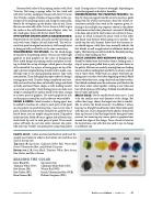
(SG) (CYP) (WR) (FUB) (PhT)
(B) (TW) (RS) (RU) (BS)
PALETTE SETUP: Colors are listed and laid out with most fre- quently used colors in order in the bottom row and those less used in the top row.
Top row, L-R: Sap Green, Cadmium Yellow Pale, Winsor Red, French Ultramarine Blue, and Phthalo Turquoise
Bottom row, L-R: Ivory Black, Titanium White, Raw Sienna, Raw Umber, and Burnt Sienna
READING THE COLOR
Ivory Black (B) Titanium White (TW) Raw Sienna (RS)
Raw Umber (RU) Burnt Sienna (BS)
Sap Green (SG)
Cadmium Yellow Pale (CYP) Winsor Red (WR)
French Ultramarine Blue (FUB) Phthalo Turquoise (PhT)
DECORATIVEPAINTERS.ORG
The Decorative Painter
• SUMMER 2017 81
