
Page 15 - The Decorative Painter Summer 2018
P. 15
Value, Intensity, Temperature
MARIAN JACKSON mda
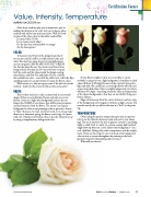
Often these attributes play just as important a part in making the decision as the color. Let’s say we have a white rosebud with yellow tints and some leaves. Well, let’s look at some of the other colors in that white rosebud first.
Is it pure white? (Cool)
Is it a creamy, warm white?
Do the tints lean toward yellow or orange? Are the leaves green?
COLOR
To have just one flower in the design means that if
you are not careful it will be a totally isolated color and
value. You may have many leaves, but remember leaves
are not just green! LEAVES ARE NOT JUST GREEN!
Yes, I’m shouting that one. To prevent your flower from
being isolated, you may need to use your leaves to repeat
both the color and the value around the design creating
some balance and flow. The underside of leaves could be
the rosebud base color – even with the yellow tints. Add rolls, flips, anything to give you an opportunity to repeat the flower colors.
While you’re at it, why not repeat some of the leaf color in the rosebud – maybe in the center, in folds as tints and accents?
VALUE
This is where you have to take a serious look at your overall design. If there are a multitude of leaves and only one or two flowers, if you use a light value background and you do not balance the VALUE of your leaves, they will become prominent and steal attention from the flower. The reason I use a green background so often in my paintings is that it gives me a chance to “hide” the leaves, for want of a better word, or to at least make them not so dominant, giving the flower center stage. As I paint with a lot of pink and red violets, there is also the vibration set up by using a complementary background color.
If your flower is light in value (as is our white or cream rosebud) it can get lost on a light background. A medium or dark value will show it off simply because of the contrast between the light and dark. (Be careful here, as your light flower will still need some strong dark values.) Also on a light background, your leaves will have to be light – matching closely the value and temperature of the chosen background so that they are not the first thing seen from a distance.
Edges of items away from the center of interest can have some of the background color rouged on with just a slight contrast. If it matches exactly, the eye will see that area as a “hole” in the paint- ing.
TEMPERATURE
Often using the opposite temperature gives you an opportu- nity to use the vibration between warm and cool to your advan- tage. The eye is drawn to the area of greatest contrast in a painting. Light vs. dark. Cool vs. warm. So a warm, creamy, light rosebud might show up better on a cool, darker value background – say a cool, dark blue. (Using color, value, temperature, and the comple- ment. If you use this setup, be sure to include some background color as tints or accents throughout the painting so the back- ground is related to the painting and vice versa.)
What will you choose?
DECORATIVEPAINTERS.ORG
TheDecorativePainter • SUMMER 2018 13
Certification Corner
