
Page 9 - proceedings-01-00898
P. 9
Proceedings 2017, 1, 898 9 of 10
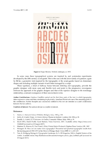
Figure 6. Fregio Mecano. Nebiolo catalogue, ca. 1955.
In some cases these typographical systems are inspired by and systematise experiments
developed by the 20th century avant-garde. This is the case with the Julien family of typefaces, again
by Bil’ak, a geometric font inspired by the typography of the avant-gardes based on elementary
shapes and including multiple variants of each letter managed by a script.
These typefaces, a kind of halfway house between lettering and typography, provide the
graphic designer with more open and flexible tools and point to the progressive convergence
between the approach of the graphic designer and that of the typeface designer to the text/image
relationship, a natural consequence of their non-exclusive roles.
Author Contributions: Gianluca Camillini carried out the first three parts of the text, in which typography
takes expressive values and then considering its physicality. Jonathan Pierini took care of the remaining parts of
the contribution. Further thoughts and conclusions outlined in this text are intended as a joint collaboration
between the two authors.
Conflicts of Interest: The authors declare no conflict of interest.
References
1. Salaris, C. Marinetti Editore; Il Mulino: Bologna, Italy, 1990; p. 109.
2. Hollis, R. Graphic Design. A Coincise History; Thames & Hudson: London, UK, 1994; p. 38.
3. Fanelli, G.; Godoli, E. Il Futurismo e la Grafica; Comunità: Milano, Italy, 1988; p. 18.
4. Dutch DFA, Dutch Profile: Karel Martens, Video Interview, 2011. Available online: https://vimeo.com/
31486228 (accessed on 10 August 2017).
5. Martens, K.; Kinross, R.; Van Triest, J. (Eds.) Printed Matter/Drukwerk; Hyphen Press: London, UK, 1997.
6. Weingart, W. How can one make swiss typography? Theoretical and practical typographic results from
the teaching period 1968–1973 at the School of Design, Basel. Octavo 1987, 87, 4, 219–237.
7. Tam, K. Wolfgang Weingart’s Typographic Landscape. In 2 + 3D Magazine, 2003, 6. English Version of the
Article. Available online: http://keithtam.net/documents/weingart_article_q&a_keithtam.pdf (accessed on
10 August 2017).