
Page 53 - the art of mushrooms
P. 53
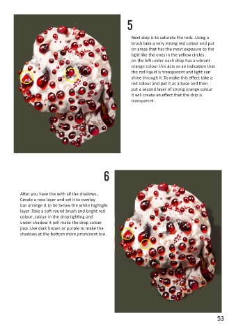
5
 3


                                                                   Next step is to saturate the reds .Using a
                                                                   brush take a very strong red colour and put
 After you have colour in the red
 circles , Using the reference paint in                            on areas that has the most exposure to the
                                                                   light like the ones in the yellow circles .
 the white area of the mushroom                                    on the left under each drop has a vibrant
 avoiding the red part .Work around it                             orange colour this acts as an indication that
 and the colour picker is a useful tool                            the red liquid is transparent and light can
 for this part .After that add smaller
 red dots using one colour. As for the                             shine through it .To make this effect take a
                                                                   red colour and put it as a base and then
 red liquid add shadows from light to                              put a second layer of strong orange colour
 dark to indicate light passing through                            it will create an effect that the drip is
 it .The tip here is to not use black as                           transparent .
 shadows but very dark purple and for
 midtones use purplish grey to
 emulate realistic lighting.


                                                     6


 4         After you have the with all the shadows ,

           Create a new layer and set it to overlay
           but arrange it to be below the white highlight

 Time to add the higlights on the red liq-  layer .Take a soft round brush and bright red
 uids to make it look glossy .Create a new   colour ,colour in the drop lighting and
 layer.Use white strokes on each of the   under shadow it will make the drop colour
 red blobs but remember to follow the   pop .Use dark brown or purple to make the
 reference for lighting accuracy.   shadows at the bottom more prominent too.
 When working with harsh light do not
 simply put a white dot it will look fake
 but put in like a smudged manner .


 52                                                                                                            53