
Page 25 - CAS- Undergraduate-Research-Manual
P. 25
25
some are easier to read than others (Times, Helvetica are good fonts). The pitch should not be
less than 24 point for text and 36 for the heading. The poster should be readable from 1m
away.
- Graphics – Photos and other graphics should be of high quality and attractive. Keep graphs
simple. Labels should be embedded on the graph, rather than using an index. Avoid distractions
like background color and effects that are too pronounced.
- Color – Certain colors work together better than others. Coordinate colors properly for best
effects. Think about contrast when choosing colors. Limit colors to 2-3, and used in consistent
fashion (e.g., headings = blue; subheadings = yellow, etc.).
Selecting a poster material
Poster materials vary in thickness, flexibility, size, color, etc. At BSU, most students print their posters
on large-scale printers that use rolled paper. The finished poster can be rolled up for easy
transportation. However, it is prone to damage by tearing. It requires a rigid back board for support
when being displayed. If a rigid product is preferred, thick Styrofoam products are available at places
like Kinko’s. They are more expensive and sturdier than rolled paper, but less convenient to transport.
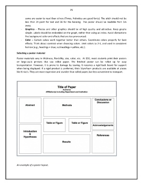
An example of a poster layout.