
Page 68 - Kitab Identiti (PPZ Corporate Identity Guideline)
P. 68
KITAB IDENTITI | PANDUAN IDENTITI KORPORAT PPZ
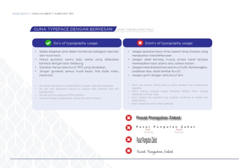
GUNA TYPEFACE DENGAN BERKESAN USING TYPEFACE EFFECTIVELY
Do’s of typography usage: Dont’s of typography usage:
• Selalu tetapkan jenis dalam kombinasi bahagian atas kes • Jangan gunakan kesan khas seperti drop shadow yang
dan huruf kecil. menjejaskan kebolehbacaan.
• Hanya gunakan warna atau warna yang diluluskan • Jangan ubah kerning (ruang antara huruf semasa
berbeza dengan latar belakang. menetapkan tajuk utama atau salinan badan.
• Gunakan hanya jenis huruf PPZ yang diluluskan. • Jangan memutarbelitkan jenis huruf (cth, Kembangkan,
• Jangan gunakan semua huruf besar; kita tidak mahu padatkan atau ubah bentuk huruf).
menonjol. • Jangan ganti dengan jenis huruf lain.
• Do always set type in a combination of upper case and lowercase. • Don’t use special effects such as drop shadow that compromise
• Do use only approved colours or colours that contrast with the legibility.
background. • Don’t change kerning (space between letters) when setting
• Do use only the approved PPZ typeface. headlines or body copy.
• Do avoid using all uppercase; we do not want to shout. • Don’t distort the typeface (e.g, expand, condense or modify the
letter forms).
• Don’t substitute with other typeface.
Pusat Pungutan Zakat
P usa t P ungutan Zak a t
Kerning Kerning
Pusat Pungutan Zakat