Page 26 - manual final 1
P. 26
3.9 Background Color Control


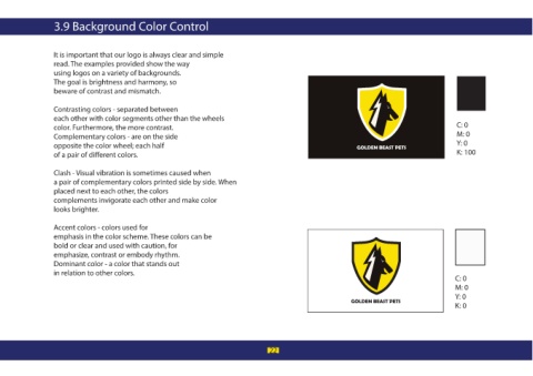
                  It is important that our logo is always clear and simple
                  read. The examples provided show the way
                  using logos on a variety of backgrounds.
                  The goal is brightness and harmony, so
                  beware of contrast and mismatch.

                  Contrasting colors - separated between
                  each other with color segments other than the wheels
                  color. Furthermore, the more contrast.                                                                                         C: 0
                  Complementary colors - are on the side                                                                                         M: 0
                  opposite the color wheel; each half                                                                                            Y: 0
                  of a pair of di erent colors.                                                                                                  K: 100

                  Clash - Visual vibration is sometimes caused when
                  a pair of complementary colors printed side by side. When
                  placed next to each other, the colors
                  complements invigorate each other and make color
                  looks brighter.


                  Accent colors - colors used for
                  emphasis in the color scheme. These colors can be
                  bold or clear and used with caution, for
                  emphasize, contrast or embody rhythm.
                  Dominant color - a color that stands out
                  in relation to other colors.
                                                                                                                                                 C: 0
                                                                                                                                                 M: 0
                                                                                                                                                 Y: 0
                                                                                                                                                 K: 0


                                                                                      22

