Page 19 - I-Plants Magazine special 2021 Biophilic Design Awards issue - regular res
P. 19
19


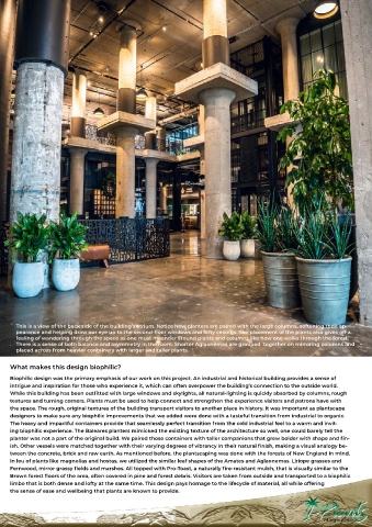
      This is a view of the back side of the building’s atrium. Notice how planters are paired with the large columns, softening their ap-
      pearance and helping draw our eye up to the second-floor windows and lofty ceilings. The placement of the plants also gives off a
      feeling of wandering through the space as one must meander around plants and columns like how one walks through the forest.
      There is a sense of both balance and asymmetry in the room. Shorter Aglaonemas are grouped  together on mirroring columns and
      placed across from heavier containers with larger and taller plants.

    What makes this design biophilic?

    Biophilic design was the primary emphasis of our work on this project. An industrial and historical building provides a sense of
    intrigue and inspiration for those who experience it, which can often overpower the building’s connection to the outside world.
    While this building has been outfitted with large windows and skylights, all natural-lighting is quickly absorbed by columns, rough
    textures and turning corners. Plants must be used to help connect and strengthen the experience visitors and patrons have with
    the space. The rough, original textures of the building transport visitors to another place in history. It was important as plantscape
    designers to make sure any biophilic improvements that we added were done with a tasteful transition from industrial to organic.
    The heavy and impactful containers provide that seamlessly perfect transition from the cold industrial feel to a warm and invit-
    ing biophilic experience. The Baleares planters mimicked the existing texture of the architecture so well, one could barely tell the
    planter was not a part of the original build. We paired those containers with taller companions that grew bolder with shape and fin-
    ish. Other vessels were matched together with their varying degrees of vibrancy in their natural finish, making a visual analogy be-
    tween the concrete, brick and raw earth. As mentioned before, the plantscaping was done with the forests of New England in mind.
    In leu of plants like magnolias and hostas, we utilized the similar leaf shapes of the Amates and Aglaonemas. Liriope grasses and
    Fernwood, mirror grassy fields and marshes. All topped with Pro-Toast, a naturally fire-resistant mulch, that is visually similar to the
    Brown forest floors of the area, often covered in pine and forest debris. Visitors are taken from outside and transported to a biophilic
    limbo that is both dense and lofty at the same time. This design pays homage to the lifecycle of material, all while offering
    the sense of ease and wellbeing that plants are known to provide.

