
Page 359 - ABCTE Study Guide_Neat
P. 359
statistical analysis is then needed to tell us if the results are real or simply chance. If a large group of
people tries the new treatment, a similar size control group tries a placebo treatment. If significantly more
people getting the new treatment are cured, then we can say that the new treatment is effective. We might
also use the accepted treatment as a control group to test if the new treatment is more effective than the
old treatment. In this type of research, the ideal experiment is a double-blind controlled experiment.
Question
You are designing and conducting an experiment to test the claim that magnetic wristbands can reduce
the symptoms of arthritis. Which of the experimental procedures listed below is important to make sure
your results are valid?
A Making sure that all the patients in the study have magnetic wristbands
B Using a control group of patients who do not have arthritis and also giving them
magnetic wristbands
C Limiting the study to fewer than ten patients to make the results simpler to analyze
D Making sure that neither the patients nor the doctors evaluating their symptoms know
who has the wristbands that are magnetic
Answer
The correct choice is D, which describes the double-blind experimental procedure. Choice A does not
provide a control group. Choice B provides an incorrect control group. Choice C is too small a sample size
to provide accurate statistics.
Experimental Data
Experimental data are often in numerical form. A table of numbers may be sufficient for relatively simple
data, but in the case of many or complex data we often need ways to visualize these data. It may be
difficult to interpret this numerical data if it is simply listed as a table of numbers.
Scientists have devised many ways to visualize their data that depend on the type of data presented.
Geologists, for example, frequently use maps. A geological map may show elevations, rock types, fault
lines, or many other forms of geologic data. Maps can also be useful in other areas of science. Biologists
might use a map to show the habitat of a certain species. Astronomers use maps of the sky to indicate
positions of celestial objects.
A biologist might record the percentage of organisms in a
sample or in a population that have particular characteristics.
Such data might best be expressed as a pie chart.
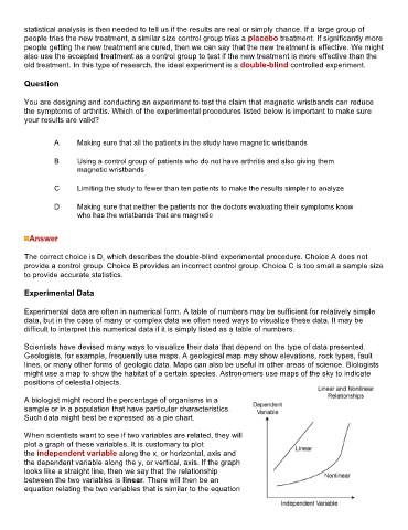
When scientists want to see if two variables are related, they will
plot a graph of these variables. It is customary to plot
the independent variable along the x, or horizontal, axis and
the dependent variable along the y, or vertical, axis. If the graph
looks like a straight line, then we say that the relationship
between the two variables is linear. There will then be an
equation relating the two variables that is similar to the equation