
Page 55 - COMPUTER
P. 55
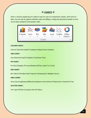
CHARTS
Chart is visually appearing and makes it easy for user to comparisons patters, and trends in
data. You can see at a glance whether sales are felling or rising over quarterly periods or how
actual sales compare to the project sales.
COLUMN CHART:-
Column Chart Are Used To Compare Values Across Cateress.
LINE CHART:-
Line Chart Are Used To Display Trend Over Time.
PIE CHART:-
Pie Chart Displays The Contribution Of Each Value To A Total.
BAR CHART:-
Bar Chart Is The Best Chart Type For Comparing To Multiple Values.
AREA CHART:-
Area Chart Emphasize Differences Between Several Sets Of Data Over A Period Of Time.
SCATTER CHART:-
The Type Of Chart Compares Pair Of Values.
54