
Page 27 - Prescription for Crime Drug Testing
P. 27
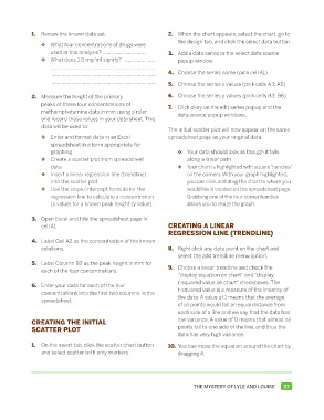
1.  Review the known data set.                      2.  When the chart appears, select the chart, go to
                                                                    the design tab, and click the select data button.
             	   ❖   What four concentrations of drugs were
                    used in this analysis? ...............................  3.  Add a data series in the select data source
             	   ❖  What does 1.0 mg/ml signify?  ......................  popup window.
                     .........................................................................
                     .........................................................................   4.  Choose the series name (pick cell A1)
                     .........................................................................  5.  Choose the series x values (pick cells A3: A6)


             2.  Measure the height of the primary               6.  Choose the series y values (pick cells B3: B6)
                 peaks of these four concentrations of           7.  Click okay on the edit series popup and the
                 methamphetamine data in mm using a ruler           data source popup windows.
                 and record these values in your data sheet. This
                 data will be used to:
                                                                 The initial scatter plot will now appear on the same
             	   ❖   Enter and format data in an Excel           spreadsheet page as your original data.
                    spreadsheet in a form appropriate for
                    graphing                                     	  ❖   Your data should look as though it falls
             	   ❖  Create a scatter plot from spreadsheet              along a linear path
                    data                                         	  ❖   Your chart is highlighted with square ‘handles’
             	   ❖  Insert a linear regression line (trendline)         on the corners. With your graph highlighted,
                    into the scatter plot                               you can click and drag the chart to where you
             	   ❖  Use the slope/intercept formula for the             would like it located on the spreadsheet page.
                    regression line to calculate a concentration        Grabbing one of the four corner handles
                    (x value) for a known peak height (y value).        allows you to resize the graph.


             3.  Open Excel and title the spreadsheet page in
                 cell A1                                         CREATING A LINEAR
                                                                 REGRESSION LINE (TRENDLINE)
             4.  Label Cell A2 as the concentration of the known
                 solutions.                                      8.  Right click any data point on the chart and
                                                                    select the add trendline menu option.
             5.  Label Column B2 as the peak height in mm for
                 each of the four concentrations.                9.  Choose a linear trendline and check the
                                                                    “display equation on chart” and “display
                                                                    r-squared value on chart” checkboxes. The
             6.  Enter your data for each of the four
                 concentrations into the first two columns in the   r-squared value is a measure of the linearity of
                 spreadsheet.                                       the data. A value of 1 means that the average
                                                                    of all points would fall an equal distance from
                                                                    each side of a line and we say that the data has
             CREATING THE INITIAL                                   low variance. A value of 0 means that almost all
             SCATTER PLOT                                           points fall to one side of the line, and thus the
                                                                    data has very high variance.
             1.  On the insert tab, click the scatter chart button   10. You can move the equation around the chart by
                 and select scatter with only markers.              dragging it.


                                                                          THE MYSTERY OF LYLE AND LOUISE    27