Page 92 - FULL REPORT 30012024
P. 92
vii.   Admin’s Data Page


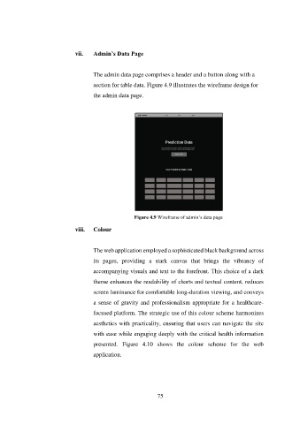
                                      The admin data page comprises a header and a button along with a
                                      section for table data. Figure 4.9 illustrates the wireframe design for

                                      the admin data page.


                                                      Figure 4.9 Wireframe of admin’s data page

                               viii.   Colour


                                      The web application employed a sophisticated black background across

                                      its  pages,  providing  a  stark  canvas  that  brings  the  vibrancy  of
                                      accompanying visuals and text to the forefront. This choice of a dark

                                      theme enhances the readability of charts and textual content, reduces

                                      screen luminance for comfortable long-duration viewing, and conveys
                                      a sense of gravity and professionalism appropriate for a healthcare-

                                      focused platform. The strategic use of this colour scheme harmonizes
                                      aesthetics with practicality, ensuring that users can navigate the site

                                      with ease while engaging deeply with the critical health information

                                      presented.  Figure  4.10  shows  the  colour  scheme  for  the  web
                                      application.


                                                               75

