
Page 419 - Algebra 1
P. 419
6L A B
Drawing Histograms
Graphing Calculator Lab (Use with Lesson 62)
Graphing Calculator Tip
For help with entering data into a list, see the graphing calculator keystrokes in Lab 4.
Online Connection www.SaxonMathResources.com
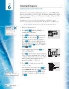
A histogram is a vertical bar graph that organizes data into equally sized intervals. This makes it easy to see where the majority of data values fall in a measurement scale. Given a set of data, you can make a histogram with a graphing calculator.
A teacher has test scores for her class and wants to know how many students earned higher than 70 points. Use the data to make a histogram.
30, 33, 33, 34, 55, 56, 63, 65, 67, 71, 80, 82, 85, 88, 89, 90, 90, 97
1. Enter the data into List 1.
2. Press and select 1:Plot1... to open the plot setup menu.
3. Press to turn Plot1 On and then press the key once and the key twice to select the type at the end of the first row.
Press . The setting for Xlist should be L1 and Freq should be 1. If the Xlist setting is not L1, press the key once and then
.
4. Create a histogram by pressing and
selecting 9:ZoomStat.
Press . The first interval has a minimum value of 30 and a maximum value of 43.4. To count the students who earned a score higher than 70 points, the intervals need to be graphed in multiples of 10 points.
5. Press to change the intervals and window settings.
The lowest test score is 30, so press to accept Xmin=30. Since the test scores do not exceed 100 points, press 1 0 0 . To use intervals of 10 points, set Xscl by pressing
10 .
404 Saxon Algebra 1
