
Page 423 - Algebra 1
P. 423
Another display that can be used to show the distribution of numeric data is a histogram. A histogram is a bar graph that displays the frequency of data in equal intervals. Each bar must be the same width and should touch the bar(s) next to it.
Making a Histogram
Create a histogram of the data from Example 1.
SOLUTION
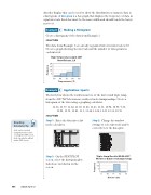
The data from Example 1 are already organized into four intervals of 10. Create a graph showing the intervals and the number of data points in each interval.
High Temperatures April 2007 New Orleans, LA
20 15 10
5
The list below shows the results in meters of the first round triple jump from the 2007 NCAA women’s outdoor track championships. Create a histogram of the data using a graphing calculator.
12.16, 11.77, 11.64, 11.50, 11.48, 11.45, 11.31, 10.94, 10.98, 9.88, 12.08, 11.58, 11.41, 11.5, 11.34, 11.24, 11.22, 11.13, 10.76
Example
3
50 60 70 80 90
Temperatures (°F)
Application: Sports
Example
4
SOLUTION
Step1: Enterthedataintoalist in the calculator.
Step3: OntheSTATPLOT screen, select the histogram plot. Labels are not shown on the screen.
Step2: Changethewindow settings to select intervals and to correctly view the data plot.
Triple Jump Results NCAA 2007 Women’s Outdoor Championship
15 10 5
Graphing Calculator Tip
Lists can be created using the home screen or using the STAT screen. Lists can only be edited in the STAT screen.
408 Saxon Algebra 1
9 10 11 12 13
Distance (m)
Frequency
Frequency
