
Page 46 - Concept_In_Archie
P. 46
ARCHITECTURE DESIGN PRINCIPLE - CONTRAST
The most common complaints designers have
about client feedback on their design is often
moves around clients who say a design needs to
“pop” more. This mean the design need to have
strong visual impact. While that sounds like a
completely arbitrary term, what the client generally
means is that the design needs more contrast.
Contrast refers to how different elements are in
a design, particularly adjacent elements. These
differences make various elements stand out.
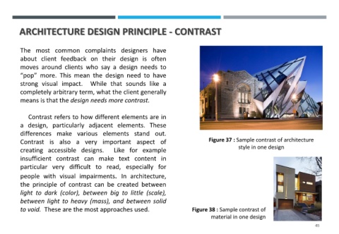
Contrast is also a very important aspect of Figure 37 : Sample contrast of architecture
style in one design
creating accessible designs. Like for example
insufficient contrast can make text content in
particular very difficult to read, especially for
people with visual impairments. In architecture,
the principle of contrast can be created between
light to dark (color), between big to little (scale),
between light to heavy (mass), and between solid
to void. These are the most approaches used. Figure 38 : Sample contrast of
material in one design
45