Page 47 - Tulsa 1921
P. 47
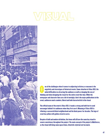
Visual of event


                                                ne of the challenges when it comes to subjecting to history or museum is the
                                                negativity and stereotypes of historical events. Same situation to Tulsa 1921, the
                                                initial difficulties in attracting the audience as well as changing the way of
                                           thinking and when designing the visual for the entire event this time. While the
                                           newspaper and character lines are a bit of nostalgia, that’s the major publications in the
                                           event, audiences need a modern, liberal and bold characteristic in the visual.


                                           The official name of the event is Tulsa 1921, it needs a strong and bold font to send
                                           messenger behind it to audiences when they first saw it. Meaning of Tulsa 1921 is
                                           tributing a successful black neighborhood and the black power for decades. The logo of
                                           event has yellow with golden strock in curve.


                                           Despite of bold and modern definition, the items will all have the same key visual to
                                           ensure consistency throughout the project. The main concept of the project is Multiverse,
                                           so the visual will bring some space items, futuristic style but not too much.


 46                                                                                                          47

