Page 9 - UANM Corporate Overview Brochure
P. 9
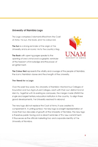
University of Namibia Logo

            The Logo comprises 3 elements lifted from the Coat
            of Arms: the sun, the book, and the colour red.


            The Sun is a strong reminder of the origin of the
            University and is an iconic link to the country’s flag.

            The Book with opening pages speaks to the
            opening of one’s mind and is a graphic reminder
            of the freedom of knowledge and the power of
            enlightenment.

            The Colour Red represents the vitality and courage of the people of Namibia,
            the iconic Namibian dunes and the strength of the University.


            The Need for a Logo


            Over the past few years, the University of Namibia inherited four Colleges of
            Education and two Agricultural Colleges, each with their own distinct brand
            identity. Together with its existing six campuses, the merger made UNAM the
            single and largest tertiary education institution in the country. To align these
            grand developments, the University resolved to rebrand.

            The new logo did not replace the Coat of Arms, it was created to
            complement it. A uniting symbol, the new logo is a bright representation of
            more than two decades of growth at the University of Namibia. The new logo
            is therefore public facing and a vibrant reminder of this new commitment.
            It thus serves as the official marketing tool and corporate identity of the
            University of Namibia.


                                                                               9

