
Page 64 - Praetura Presentation Guide Jan19
P. 64
64
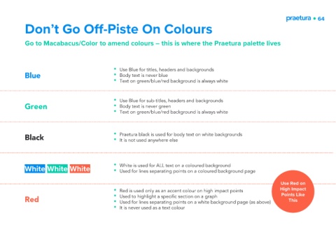
Don’t Go Off-Piste On Colours
Go to Macabacus/Color to amend colours – this is where the Praetura palette lives
• Use Blue for titles, headers and backgrounds
Blue • Body text is never blue
• Text on green/blue/red background is always white
• Use Blue for sub-titles, headers and backgrounds
Green • Body text is never green
• Text on green/blue/red background is always white
Black • Praetura black is used for body text on white backgrounds
• It is not used anywhere else
White White White • White is used for ALL text on a coloured background
• Used for lines separating points on a coloured background page
Use Red on
High Impact
• Red is used only as an accent colour on high impact points Points Like
Red • Used to highlight a specific section on a graph This
• Used for lines separating points on a white background page (as above)
• It is never used as a text colour