
Page 75 - Advertising Annual 55
P. 75
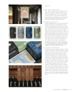
                3
EXHIBIT
Star Trek postage stamps
“These stamps commemorate the original Star Trek
television series, which debuted 50 years ago. The illustrations highlight key elements of the program, and the silhouettes contain secondary references.”
Antonio Alcalà, Studio A (Alexandria, VA), art director; Bill Gicker, creative director; The Heads of State, design/ illustration; United States Postal Service, client.
Vaughn’s sales promo
“Vaughn’s Original Barbecue Sauce has been helping grill aficionados all over the Southeast since 1934. Vaughn’s marketing team worked with us to create sales collateral that they could use to promote their sauce at the Specialty Foods Association’s Fancy Food Show in New York. So we went to work, creating designs and copy that spoke to the types of meat and fish with which Vaughn’s pairs best. We then screen printed posters and hand-cut information cards to be given out by Vaughn’s marketing team at the show. The work proved to be successful, and Vaughn’s has been added to the sauce aisle in several grocery stores around the southeastern United States.”
Ryon Edwards, art director; Jason Corbin, writer/creative director; Cathy Riggs Monetti, executive creative director; Lauren Bowles Harring, illustrator; Riggs Partners (West Columbia, SC), ad agency; Vaughn’s BBQ, client.
Fort Point brand identity
“Established in 2014, Fort Point Beer Company is a craft brewery in San Francisco, situated in a historic Presidio building. The location—close to both the Golden Gate Bridge and the Fort Point National Historic Site— provided inspiration for us to create the modular, illustrative brand identity that went beyond a logo to leverage as its backbone recognizable architectural elements of the bridge and the historic sites. The beer champions the spirit of the city and creates a unique and authentic sense of place while helping establish Fort Point Beer Company as the new wave of San Francisco–based brewing. We selected color combina- tions that would be a deliberate departure from more typical beer packaging, with the intention of cutting through shelf and aisle clutter. The result is a set of designs that look elegant and refined, yet still playful.”
Eileen Lee, designer; Tom Crabtree, creative director; Manual (San Francisco, CA), design firm; Fort Point Beer Company, client.
 1
2
  3
 Communication Arts | commarts.com 75
