
Page 16 - print
P. 16
Video platform: a customizable, rich media solution | 15
The design process of the front-end went pretty smoothly, without any hassle. I have quite a creative mind, and with the
notes I had made during the interviews I knew what to draw up. It went even better after using the library strategy by
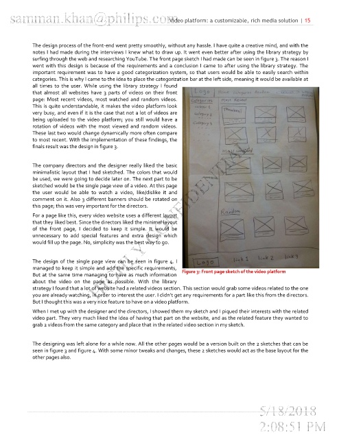
surfing through the web and researching YouTube. The front page sketch I had made can be seen in figure 3. The reason I
went with this design is because of the requirements and a conclusion I came to after using the library strategy. The
important requirement was to have a good categorization system, so that users would be able to easily search within
categories. This is why I came to the idea to place the categorization bar at the left side, meaning it would be available at
all times to the user. While using the library strategy I found
that almost all websites have 3 parts of videos on their front
page: Most recent videos, most watched and random videos.
This is quite understandable, it makes the video platform look
very busy, and even if it is the case that not a lot of videos are
being uploaded to the video platform; you still would have a
rotation of videos with the most viewed and random videos.
These last two would change dynamically more often compare
to most recent. With the implementation of these findings, the
finals result was the design in figure 3.
The company directors and the designer really liked the basic
minimalistic layout that I had sketched. The colors that would
be used, we were going to decide later on. The next part to be
sketched would be the single page view of a video. At this page
the user would be able to watch a video, like/dislike it and
comment on it. Also 3 different banners should be rotated on
this page; this was very important for the directors.
For a page like this, every video website uses a different layout
that they liked best. Since the directors liked the minimal layout
of the front page, I decided to keep it simple. It would be
unnecessary to add special features and extra design which
would fill up the page. No, simplicity was the best way to go.
The design of the single page view can be seen in figure 4. I
managed to keep it simple and add the specific requirements,
Figure 3: Front page sketch of the video platform
But at the same time managing to have as much information
about the video on the page as possible. With the library
strategy I found that a lot of website had a related videos section. This section would grab some videos related to the one
you are already watching, in order to interest the user. I didn’t get any requirements for a part like this from the directors.
But I thought this was a very nice feature to have on a video platform.
When I met up with the designer and the directors, I showed them my sketch and I piqued their interests with the related
video part. They very much liked the idea of having that part on the website, and as the related feature they wanted to
grab 2 videos from the same category and place that in the related video section in my sketch.
The designing was left alone for a while now. All the other pages would be a version built on the 2 sketches that can be
seen in figure 3 and figure 4. With some minor tweaks and changes, these 2 sketches would act as the base layout for the
other pages also.