Page 20 - JanuaryBuilderBrief
P. 20
2018 Color


           of the Year


              Since  2000  the  Pantone  Color  Institute  has
             been selecting and introducing the Color of the
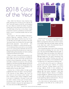
             Year. Pantone’s experts comb the world looking         SW 6496
             for color influences which best define the global      Oceanside               AF - 290
                                                                                            Caliente
             intellectual, moral, and cultural climate of the era.
             The 2018 Color of the Year is Ultra Violet. A bold
             purple that could be considered a shock-to-the-
             system hue or it could be exactly what we need
             right now.
              Ultra Violet is “...the most complex of all colors,”
             Leatrice  Eiseman,  executive  director  of  the
             Pantone Color Institute told The New York Times.        Pantone was once a name only designers  and
             “It’s also the most complex of all colors,” she said,   printers knew. The Pantone Matching System
             “because it takes two shades that are seemingly       (PMS) is a proprietary color space used in a variety
             diametrically opposed — blue and red — and            of industries. Although primarily used in printing
             brings them together to create something new.”        it has also been used in the manufacturing of
             The combining of blue and red is a not so subtle      colored paint, fabric, and plastics.
             nod to the current political climate. The red and       Over the past few years many other companies
             blue are combined to provide us with hope and         have started introducing their own color of the
             wishful thinking that someday we’ll all be working    year. This year Sherwin Williams has brought us
             together towards the same goal.                       Oceanside. A lively combination of rich blue and
              Within one week of being announced you can           green that have a marine-inspired feel. Sherwin
             easily find a vast array of products available in     Williams states that “It’s green-meets-blue  tone
             Ultra Violet. The Color of the Year can be found      can also boost creative thinking and clarity  of
             on tennis shoes, bag packs, suitcases, make-up,       thought in a home office, or invite meditation and
             nail polish, and home accessories. How does this      introspection into a bedroom or reading nook.”
             happen so fast? Pantone had already presented           On the other end of the spectrum is Benjamin
             their fashion color palettes for Spring 2018 a few    Moore’s color of the year, Caliente. It’s a spicy
             months ago. One of the colors included in the         red full of warmth. “Strong, radiant, and full of
             palette was, of course, Ultra Violet.                 energy, Caliente AF-290  is  total  confidence.  It
              Pantone has a limited edition formula guide          is  pleasing,  passionate  and makes  people  feel
             available that show the color in varying shades.      special, like ‘red carpet treatment’,” said Ellen
             If the intensity of Ultra Violet is too much for      O’Neill, Benjamin Moore Director of Strategic
             your taste you can choose a softer version. The       Design Intelligence. “Whether used as one note or
             early consensus from interior designers seems         on four walls, the spirited personality of red turns
             to be use in moderation. The pop of color can         heads signaling surprise and adventure. The eye
             be used in pillows, lamps, art, furniture pieces,     can’t help but follow its bold strokes.”
             accessories, and curtains. There will be a fine         One clear statement being made by all three
             balance between using just the right amount of        companies is that 2018 will be a bold year in
             the color and overwhelming the space.                 design.
       20                              JANUARY 2018  |  GREATER SAN ANTONIO BUILDERS ASSOCIATION

