
Page 32 - teachers.PDF
P. 32
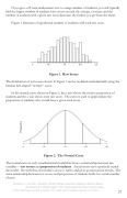
If you give a 25-item mathematics test to a large number of students, you will typically find the largest number of students have scores around the average, or mean, and the number of students with a given raw score decreases the further you get from the mean.
Figure 1 illustrates a hypothetical number of students with each test score.
5 10 15 20 25
Figure 1. Raw Scores
The distribution of test scores shown in Figure 1 can be modeled mathematically using the familiar bell-shaped "normal" curve.
In the normal curve shown in Figure 2, the y axis shows the relative proportion of students and the x axis shows total raw score. The curve is used to approximate the proportion of students who would have a given total score.
5 10 15 20 25
Figure 2. The Normal Curve
The normal curve is only a mathematical model that shows a relationship between two variables -- test scores and proportion of students. Actual scores never perfectly match the model. Nevertheless, the model is close to reality and gives good practical results. The same relationship between test scores and proportion of students holds for a wide number of tests.
Rudner, L. and W. Schafer (2002) What Teachers Need to Know About Assessment. Washington, DC: National Education Association.
From the free on-line version. To order print copies call 800 229-4200
27
Frequency
