
Page 53 - TheDecorativePainter_DP4_Winter_2018
P. 53
Like frosting I am talking about using white. Therefore white is the last color and ONLY used after the other colors are placed as “neighbors.”
To take advantage of the comparative values in each area, it is important to look at our adjoining neighbors. Whether looking at trees, houses,
or horses, the rule that makes art “pop” is its comparative values of colors that live next to each other. To get your painting to “pop,” try using your darkest dark color next to your lightest light color. This is the spot where attention will be drawn on your design.
So back up 10 feet and decide where you want this spot to be. Avoid making too many attention areas pop as this will turn your design busy.
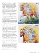
Let’s revisit our light source coming from the left and check out where the shadow of white mane should be. Since we cannot go lighter than white it should only be at the highest (lightest) points of the face, chest, legs, and mane.
The mane should have waves of highlight starting at top of peak of head and neck and running through the neighborhood. Draw single long hairs outside the design using your script liner.
White is very easy to overdo, creating a chalky look to your horse.
The nice thing here is this condition can sometimes be fixed by reinstating “comparative values” in the mid-tone areas (Antique Gold and Burnt Sienna
or Burnt Sienna and Cadmium Orange or thinned Mediterranean Blue). This makes neighbors once again work together.
Again evaluate your painting from 10 feet away, or try it on. You may want to reinstate parts of the foreground by adding vertical blades of grass or horizontal ground under his feet in thinned Dioxazine Purple. Look for triangles of darkness. Can these be a bit darker? Try Hauser Light Green sunlight on left side of grass.
Garden flowers are fun. Just don’t make them a focal point. Splash water marks are made with spackled, watered-down white and palette colors.
Add some of these colors into his legs and mane. This is called “referred” color and can make your design win a blue ribbon! And that’s what it is
all about!
Heat-set your paints using cotton setting on iron at 2 minutes per section. I cover design with a brown paper bag as insurance against scorching. Turn
your shirt inside out and wash to remove the resist. Retouch watercolor edges and shadows/highlights as needed.
Sign your name and heat-set new painted areas. Send me a photo!
STEP 4
DECORATIVEPAINTERS.ORG 51
CLOSEUP
