Page 17 - Yassine El Moumni Book
P. 17
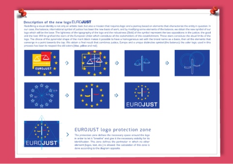
and the bad, Will be grafted the stars of the European Union which constitute all the stakeholders of this establishment. These stars constitute the visual limits of the
                     logo. The choice of the pyramidal shape of the mark block makes it possible to have a homogeneous set with the brand name as a basis, then all the elements that
                       converge in a point towards the top. We obtain a final result that combines justice, Europe and a unique distinctive symbol (the balance). the color logic used in this
                  logo which will be the base. The lightness of the typography of the logo and the robustness (Bold) of the symbol represent the two oppositions in the justice, the good
               Redefining a visual identity is not only an artistic task, but also a mission that requires logic and a journey based on elements that characterize the entity in question. In
                our case, the balance, international symbol of justice has been the new basis of work, and by modifying some elements of the balance, we obtain the new symbol of our


                                                                    EUROJUST logo protection zone
                                                                        in order to let it "breathe" and give it the necessary visibility for its
                                                                          identification. This zone defines the perimeter in which no other
                                                                       The protection zone defines the necessary space around the logo


                                                                             done according to the diagram opposite. element (logos, text, etc.) is allowed. the calculation of this zone is


             Description of the new logo  process has been to respect the old colors (blue, yellow and red).

