Page 27 - William Brown 2017
P. 27

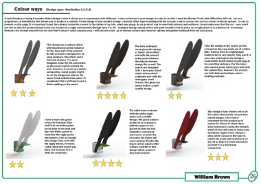
Colour ways                  (Design spec- Aesthetics 3.1-3.6)


     A useful feature of using Computer Aided design is that it allows you to experiment with different  colour schemes to your design. In order to do this, I used the Render Tools, with OfficeView 360 wh ich is a
     programme on SolidWorks that allows you to produce a realistic virtual image of your product (Image s below). After experimenting with the colours, I had to choose the correct colour/material options  to use to
     present on this page. It is important to get the colours/materials correct to the tastes of my inte nded user group. As my product can be used both indoors and outdoors, I must make sure that the col ours aren’t
     too vile so that the product doesn’t look out of place in a rugby environment (Design spec-??), for  example having vibrant yellow with pink wouldn’t look in place on a rugby pitch or in a fitness en vironment.
     However, the colours shouldn’t be too dull that it doesn’t catch peoples eyes. I will present a ran ge of various colours and material options and gather feedback from my user group.


                                            This design has a natural effect                                                The dark mahogany                                              I like the design of the panels on this
                                            with beachwood as the material                                                  wood gives this design                                         concept as they are made out of carbon
                                            for the base part of my product.                                                a ‘luxury’ style effect                                        fibre. Carbon fibre is a lightweight
                                            As this product is designed to be                                               and with the product                                           material but is very strong. They use it in
                                            used outdoors, this effect won’t                                                being used outdoors,                                           race cars which gives the design a
                                            look out of place. I’ve used                                                    the natural wooden                                             modernistic touch which should appeal
                                            tungsten metal for the pad panels                                               design fits in well. The                                       to a sporting audience. For the base I
                                            as the wood/metal contrast fits                                                 panels are designed                                            have used a metal which goes well with
                                            well. However, in terms of a safety                                             with a dark grey/black                                         the carbon fibre, however, the colours
                                            perspective, metal panels might                                                 matte colour which                                             are both dark and perhaps need a
                                            be on the dangerous side as the                                                 contrasts well with the                                        dividing contrast.
                                            users’ head could hit the panel. To                                             mahogany wood.
                                            counteract this I will have to put a                                            Overall, this gives the
                                            thick padding on the panel.
                                                                                                                            jackal trainer a high
                                                                                                                            quality design.


                                                                                                                       The white base matches                                                 This design I have chosen red to be
                                                                                                                       with the white rugby                                                   the colour that stands out and also
                                                                                                                       posts so is a subtle                                                   means danger. This I feel is
                                          I have chosen the green                                                      design. The grass pattern                                              important for this product as it
                                          colour for the post clips                                                    on the lid is to blend in                                              means for others to stand clear
                                          and lid to resemble grass                                                    with the grass on the                                                  when someone is using the product,
                                          at the base of the post and                                                  ground so that the ball                                                which in turn will help to reduce any
                                          then the white panels to                                                     beneath is concealed                                                   accidents. Again I have chosen a
                                          resemble the rugby posts                                                     even more, so when the                                                 shiny white colour on the base to
                                          themselves. I felt as though                                                 lid opens the player will                                              match the posts and used black on
                                          this design links well with                                                  react quicker. Finally, the                                            the lid so that it is more obvious to
                                          the rugby theme. However,                                                    black carbon panels offer                                              see that it is a functional
                                          I have rated this colour way                                                 a sharp contrast in this                                               component.
                                          fairly low because it is a                                                   design which makes it
                                          little too simplistic.                                                       very neat product.


                                                                                                                                                                                  William Brown                                      26
   22   23   24   25   26   27   28   29   30   31   32