
Page 345 - Uros Todorovic Byzantine Painting Contemporary Eyes
P. 345
Chapter VI
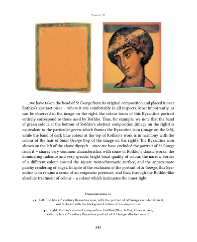
...we have taken the head of St George from its original composition and placed it over Rothko’s abstract piece – where it sits comfortably in all respects. Most importantly, as can be observed in the image on the right, the colour tones of this Byzantine portrait entirely correspond to those used by Rothko. Thus, for example, we note that the band of green colour at the bottom of Rothko’s abstract composition (image on the right) is equivalent to the particular green which frames the Byzantine icon (image on the left), while the band of dark blue colour at the top of Rothko’s work is in harmony with the colour of the hair of Saint George (top of the image on the right). The Byzantine icon shown on the left of the above diptych – since we have excluded the portrait of St George from it – shares very common characteristics with some of Rothko’s classic works: the dominating radiance and very specific bright tonal quality of colour, the narrow border of a different colour around the square monochromatic surface, and the approximate patchy rendering of edges. In spite of the exclusion of the portrait of St George, this Byz- antine icon retains a sense of an enigmatic presence, and that, through the Rothko-like absolute treatment of colour – a colour which insinuates the inner light.
Demonstration 10
41. Left: The late 12th century Byzantine icon, with the portrait of St George excluded from it, and replaced with the background colour of its composition.
42. Right: Rothko’s abstract composition Untitled (Blue, Yellow, Green on Red) with the late 12th century Byzantine portrait of St George attached over it.
343
