
Page 12 - Onboarding Toolkit
P. 12
Our Shared Purpose
Interim ‘At-A-Glance’ Style Guide
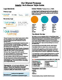
Logo Standards Colour Palette: Pantone Colours (PMS)
Our Shared Purpose’s official logo features three colours (in addition to
Primary Logo the individual site’s own brand colours). They can be used in document
design to showcase consistency and unification under the Our Shared
Purpose network banner.
Secondary Logo
PMS 144 PMS 320 PMS 7455
CMYK: CMYK: CMYK:
0-51-100-0 100-0-31-7 90-60-0-0
Icon
RGB: RGB: RGB:
237-139-0 0-160-177 64-96-175
Hex: Hex: Hex:
#ED8B00 #4060AF
The Words We Use
The words we use are an expression of the Our Shared Purpose brand.
There are two logos for the Our Shared Purpose brand, in addition When we repeat the same words and phrases in a consistent manner, they
to an icon, which can be used to support all integration-related reinforce the image we want to convey about who we are and what we do.
documents, including but not limited to: letterhead, PowerPoint If in doubt when describing programs and services at the three sites,
tempalate, memos. please visit the individual websites or contact your Communications team.
The primary logo should be the first option for external documents Names should be listed in alpha order when referring to two or more of
because of its inclusion of the three site logos. The secondary the individual sites.
logo can be used when a specific document’s design does not suit Some key phrasing to use when writing about the network includes:
the orientation or size of the primary logo.
“Advancing the health of our patients and our urban communities.”
The amount of clear space from the top and bottom of the logo and
left and right sides of the logo must be equal to or greater than the “As Catholic health organizations, our shared purpose is rooted in our
height of the OUR SHARED PURPOSE capital letters. common mission of providing excellent, compassionate care to all we
serve, including those who experience marginalization or disadvantage.”
Place logo at top of the page, either at left or centred.
The minimum acceptable size of the primary logo is 4” wide and “This network serves as a model of system integration between an academic
the minimum size for the secondary logo is 3” wide. health science centre, large community teaching centre and a post-acute
organization providing rehabilitation, palliative care, long-term care and
The logo is available in white and with a transparent background. community care.”
The logo elements (words and icon) should be kept together
wherever possible to increase brand recognition for the network Do NOT use abbreviated site/network names (PHC, SJHC, SMH, OSP)
and the individual sites. The icon alone should be used sparingly
and for design flourishes only. First reference, USE: Subsequent references, USE:
Providence Healthcare Providence
St. Joseph’s Health Centre St. Joseph’s
Typography: Our Shared Purpose’s official font is ITC Kabel St. Michael’s Hospital St. Michael’s
Medium. This font is not commonly available in Microsoft Office Our Shared Purpose Our Shared Purpose
applications. Therefore, Arial or Arial Narrow is an acceptable
substitution for integration-related communications. Font size should be Templates and tools
12 point where possible, with a minimum standard of 11 point. Available:
Letterhead
Memo
Contact your own organization’s PowerPoint
Questions?
Communications department for support. To access templates, visit your respective intranet resources.