
Page 32 - graphic standards Demo
P. 32
Region of Waterloo GRAPHIC STANDARDS and CORPORATE STYLE GUIDE 30
Effective
Not as effective
This type size is effective. This type size is not as effective.
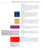
Effective leading:
Leading, or spacing between lines of text, should be at least 25 to 30 percent of the point size.This is because many people with partial sight have difficulty finding the beginning of the next line while reading.
Leading, or spacing between lines of text, should be at least 25 to 30 percent of the point size.This is because many people with partial sight have difficulty finding the beginning of the next line while reading.
Not effective leading:
Roman typefaces are ef- fective.
Slide Design
To ensure that overhead slide presentations, such as those created with PowerPoint, are easy-to-see and easy-to-understand, use a sans serif font as you would for presenting text on the Web. Have no more than five lines of text on each slide with no more than five words on each line. That way, your audience will find it easier to take in the information you are presenting.
Visual Considerations
1. Contrast
Text should be printed with the highest possible contrast. There is good evidence that for many readers who are older or partially sighted, light (white or light yellow) letters on a dark (black) background are more readable than dark letters on a light background. However, the traditional dark on light may be aesthetically preferable.
2. Type Color
Very high contrasts are difficult to achieve with color combinations other than black and white. Printed material, generally, is most readable in black and white. Different colours may be important for aesthetic or other reasons, but it is better to use such combinations only for larger or highlighted text, such as headlines and titles.
3. Point Size
Type should be large, preferably at least 16 to 18 points, but keep in mind that the relationship between readability and point size differs somewhat among typefaces.
4. Leading
Leading, or spacing between lines of text, should be at least 25 to 30 per cent of the point size. This is because many people with partial sight have difficulty finding the beginning of the next line while reading.
5. Font Family
Decorative typefaces are not as effective.
Avoid complicated, decorative or cursive fonts and, when they must be used, reserve them for emphasis only. Standard serif or sans-serif fonts, with familiar, easily recognizable characters are best. Also, there is some evidence that sans-serif fonts are more legible when character size is small relative to the reader’s visual acuity.
Effective
Not as effective
Sans-serif typefaces are effective.
Condensed typefaces are not as effective.
