
Page 5 - The Color Issue
P. 5
Color, composition and emotion.
Today we’re going to talk about color: how to achieve vibrant mixes and create eye catching visuals.
To retouch an image you NEED to understand LIGHT. It’s not a sort of or a “I’ll figure it out later” situation.
Color is formed by light, then
translated by our eyes and brain
to transmit data. If you don’t
understand how light moves and
interacts with the environment,
then creating believable images is next to impossible.
SATURATION
Often mistaken for the color fix all, saturation doesn’t do all the work for you. Saturation is meant to give the hues a boost. When overused the saturation will actually pull your image away from believable and go straight for a psychedelic feel. Instead try slightly raising the vibrancy along with the saturation. But go easy.
FILTERS
By far my most trepidatious topics when talking about retouching. I am a firm believer that filters do NOT make you a professional. They are but a SMALL tool in a retoucher’s arsenal. Use them, but never as a stand alone “fix”. When I need a blanket color tone for an image, I can use the preset photo filters that PS has in the adjustments panel OR I can go to Layers> New Fill Layer> Solid color and select ANY color I need. This is the truest way to create unique work to YOUR STYLE. From here, there are any number of edits you can make with a blanket color tone. You can set the blend mode to your desired effect and then use an Inverted mask and hand paint select areas you want that color to appear in. There’s also gradients, masks and even Edit> Apply Image to explore. ALL of which will create a better image than just slapping a filter on.
But let’s start with the basics;
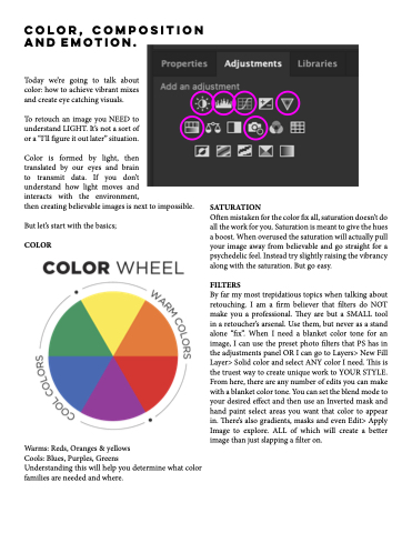
COLOR
Warms: Reds, Oranges & yellows
Cools: Blues, Purples, Greens
Understanding this will help you determine what color families are needed and where.
