
Page 6 - The Color Issue
P. 6
SHADOWS
One of the biggest mistakes I see new retouchers do over and over is use black to shade in a bright and colorful image. Shadow is not the addition of black, but instead the addition of cooler/darker ambient colors within the environment. When black or grey is added it creates a muddy mess and actually works against getting those bright, rich colors. Instead, shadow using a cool tone such as blue or purple. Look at the environment though- if the subject is outside surrounded by vegetation the shadow might need a shade of green instead of purple/blue. When in doubt- eyedropper a darker shade within the image and use that as your color tone. It will be true to the colors already in the image. Just dont forget to turn your flow rate down as you brush in your shadows.
HIGHLIGHTS
Highlights are not just bright spots on your image. Look at the direction of the light source; is it strong? Diffused? Light naturally creates pockets of shadows as it falls across surfaces (especially faces such as next to noses, eye sockets, under chins etc) so don’t just brush a bright spot across your subject without taking this into account.
Locations closer to the light source will be brighter and those further away, more subdued. In the example images to the right you can see both are lit from one side: One below and one above. In the male’s image you can see the shadow pockets both by his nose and on the right side of his hand/fingers. This creates realistic directional light. In the woman’s portrait you can see that though she is much more lit, the shadows are still naturally falling under her chin and below her cheekbones. Follow the direction of light and learn as much as you can about the anatomy of the human skeletal system- it will help you identify areas much more quickly that need retouching attention.
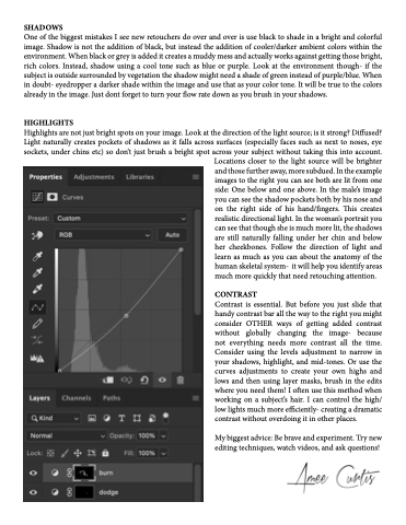
CONTRAST
Contrast is essential. But before you just slide that handy contrast bar all the way to the right you might consider OTHER ways of getting added contrast without globally changing the image- because not everything needs more contrast all the time. Consider using the levels adjustment to narrow in your shadows, highlight, and mid-tones. Or use the curves adjustments to create your own highs and lows and then using layer masks, brush in the edits where you need them! I often use this method when working on a subject’s hair. I can control the high/ low lights much more efficiently- creating a dramatic contrast without overdoing it in other places.
My biggest advice: Be brave and experiment. Try new editing techniques, watch videos, and ask questions!
