
Page 31 - Conor O Shea
P. 31
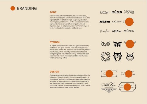
BRANDING


                                                                                  FONT                                                                             MūZen MūZen                            MūZen


                                                                                  I tested various fonts and styles, bold and non bold,
                                                                                  many fonts and styles which i narrowed down to six. The
                                                                                  highlighted font (Citadel Script) caught my attention,
                                                                                  showing class, and luxary. A coffee collection should be                        MūZen                MŪZEN              MūZen
                                                                                  represented by luxary, and following a traditional
                                                                                  Japanese style of calligraphy, i believe this font style to
                                                                                  be the best suited towards the MūZen brand.
                                                                                                                                                                   MūZen MūZen                           MŪZEN


                                                                                  SYMBOL


                                                                                  In Japan, owls (fukurō) are seen as a symbol of wisdom,
                                                                                  protection and good fortune. Their nature aligns with
                                                                                  mindfulness within the Japanese culture. Owls symbolise
                                                                                  wakefulness, which instantly connects to coffee and
                                                                                  being energized. I found this meaning of the owl to best
                                                                                  resonate with Hara’s philosophy and the wakefulness
                                                                                  whilst consuming coffee.


                                                                                  DESIGN
                                                                                                                                                                          MūZen                        MūZen
                                                                                  Testing Japanese style borders and words describing the
                                                                                                                                                                            COFFEE COLLECTION               ZEN COLLECTION
                                                                                  collection, i found that with Kenya Hara’s philosophy of
                                                                                  “emptiness” and having white space, can really draw the
                                                                                  attention of what matters and what you want people to
                                                                                  see the second their eyes come in contact with it and i
                                                                                  found that it would be more suitable to not have a border                            MūZen
                                                                                  which declutters the main focus, “MūZen.                                                 COFFEE COLLECTION         MūZen

                                                                                                                                                                                                           COFFEE COLLECTION
                                                                                                                                                                                                             EST 2024 原研哉