
Page 32 - Conor O Shea
P. 32
BRANDING
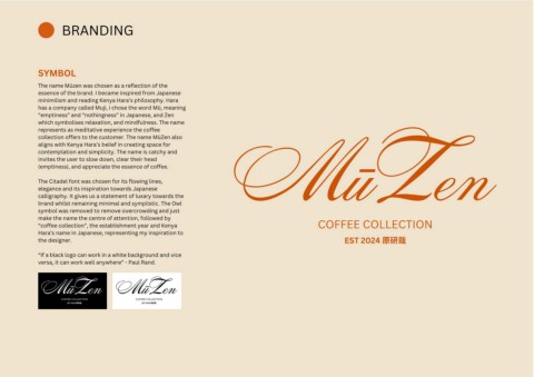
SYMBOL
The name Mūzen was chosen as a reflection of the
essence of the brand. I became inspired from Japanese
minimilism and reading Kenya Hara’s philosophy. Hara
has a company called Muji, i chose the word Mū, meaning
“emptiness” and “nothingness” in Japanese, and Zen
which symbolises relaxation, and mindfulness. The name
represents as meditative experience the coffee
collection offers to the customer. The name MūZen also
aligns with Kenya Hara’s belief in creating space for
contemplation and simplicity. The name is catchy and
invites the user to slow down, clear their head
(emptiness), and appreciate the essence of coffee. MūZen
The Citadel font was chosen for its flowing lines,
elegance and its inspiration towards Japanese
calligraphy. It gives us a statement of luxary towards the
brand whilst remaining minimal and symplistic. The Owl
symbol was removed to remove overcrowding and just
make the name the centre of attention, followed by
“coffee collection”, the establishment year and Kenya COFFEE COLLECTION
Hara’s name in Japanese, representing my inspiration to
the designer. EST 2024 原研哉
“If a black logo can work in a white background and vice
versa, it can work well anywhere” - Paul Rand.
MūZen MūZen
COFFEE COLLECTION COFFEE COLLECTION
EST 2024 原研哉 EST 2024 原研哉