Page 32 - House Style of Sketching_2023
P. 32
will be returning to the sketchbook (no pins, double sided tape or masking
masking tape and use sparingly at the back of each corner. There should
When wall mounting work do not damage the sketchwork. Remember it
tape across the corners). For wall mounting work roll up a length of
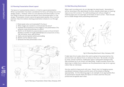
4 Fig 5.4 Mounting Sketchwork Hilary Dempsey 2015
3 Finally take time to plan where the work is going to be presented as the environment can detract from or enhance the work. Be mindful of badly lit areas, uneven surfaces, inadequate space, transparent backgrounds (like windows) as it can drown out sketching. If wall mounted, ensure the sketching is visible from a distance as the presentation may be to a group Also be careful to hang work
5.3 Wall Mounting Sketchwork
ʼnµºʼná¡Ì¡
®ʼnĂ硵Ìʼnâ µʼnÅÈ̵ҡµʼnÌ¬Ò âºÈ¬Ĝ 1 2 rather than an individual. positioned alongside each other.
When a presentation has been considered the focus will always be on the
design project. However, when it is not planned and done badly, it is the
3. Prioritise the importance of the images to the presentation (This
design. Presentation sheets cannot be generated quickly, they must be
4. Sketch on A4 sheets (it’s proportionally accurate to A3 and A2) and
planned. Take time before starting presentation sheets to run through
ĂÈÌÒʼnÒ ¡µʼnÒºʼn¡ÌÒÈyÒʼnÒ ʼnèʼnyµʼnÒÈyÒʼnȺ´ʼnÒ ʼnÅÈ̵ÒyÒ¡ºµʼnºʼnÒ ʼn
The layout of a presentation sheet is critical to a good presentation.
2. What images are needed to communicate the story?
1. What needs to be communicated? (The Story)
will govern scale and positioning of a sketch)
ʼnʼnʼnʼnʼnʼnÒ¡Ò®ĝʼnÒçÒʼn
®º¬Ìĝʼnµy´ĝʼnyÒʼnyµʼnăºâĭ develop a number of rough potential layouts (components of story, 5. Seek a second opinion before proceeding 6. Sketch out the relevant views ĎĜʼnʼn#µÈyÒʼnÒ ʼnõy®ʼnÅÈ̵ÒyÒ¡ºµʼnÌ Òʼn Fig 5.3 Planning a Presentation Sheet Hilary Dempsey 2015
5.2 Planning Presentation Sheet Layout
this list. ʼn ʼn
presentation 26

