Page 233 - 20230703_IGAI_MNG_Prototipo
P. 233
Logo (vertical)

                                                      Typography size,

                                                      leading and typography


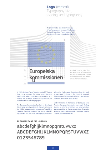
                                                      To determine the size of the font to use
                                                      in any language, we have used the longest
                                                      (Swedish) translation “kommissionen” as
                                                      a reference. The text is justified to the left.


                                                    18 x


                            12 x


                                  Europeiska                                    the word to the left determines
                                  Europeiska
                            3 x                                                 The lower case “u” taken from
                                   kommissionen
                                   kommissionen                                 of “kommissionen” and the top
                            3 x                                                 the space between the baseline
                                  European                                      line of the horizontal bar.

                            1 x
                                  Commission


                    In 2005, designer Panos Vassiliou created PF Square    allowed for the European Commission logo. It is used
                    Sans Pro in his quest for a true square-like text   in Black with 75% opacity for the CMYK logo and
                    typography, which could balance simplicity with   70% Pantone EC Corporate Blue for its 1 pms version,
                    vitality and strength, without compromising its   100% for the black & white version.
                    characteristics as a text typography.
                                                              Under the terms of the licence for EC Square Sans
                    The European Commission has further developed     Pro,  the  European  Commission  can  grant  floating
                    this original font, by adding all characters to cover   licences to external contractors and communication
                    the 23 EU languages plus languages of candidate   agencies working on Commission projects. To acquire
                    countries. This final version of the font is called EC   a floating licence, please contact the Visual Identity
                    Square Sans Pro and is the only typography version   Team of DG Communication.


                    EC SQUARE SANS PRO - MEDIUM
                    abcdefghijklmnopqrstuvwxz


                    ABCDEFGHIJKLMNOPQRSTUVWXZ


                    0123546789


                                                           18

