Page 237 - 20230703_IGAI_MNG_Prototipo
P. 237

Logo

                                                      Minimum sizes

                                                      and alternative uses


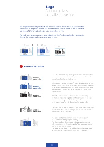
                        Due to legibility and visibility constraints and in order to avoid the “moiré” that could occur in halftone
                        reproduction of the graphic element, the recommendation is not to reproduce any of the CMYK
                        and Pantone EC Corporate Blue logos in a size smaller than 25 mm.

                        The Black logo, having no screen, is more legible. It can therefore be reproduced in a smaller size.
                        However, the recommendation is not to go below 20 mm.


                            25 mm               25 mm
                                                                   20 mm


                         !   ALTERNATIVE USES OF LOGO


                                                             The CMYK horizontal logo is designed for small communication
                                                             media such as web mobile, electronic newsletters, Facebook
                                                             pages, PowerPoint presentations, etc.

                                                             When space is limited in terms of height (for example, USB keys,
                                                             ballpoint pens, etc.), horizontal versions of the logo are available
                                                             in all formats and colour versions. These logos have to be used
                                                             with colours in 100% to ensure all elements of the logo are
                                                             clearly visible.

                                                             When the technique does not permit the correct printing
                                                             of the logo or could corrupt the graphical integrity of the logo,
                                                             you are advised to print only the European Commission name
                                                             in EC Square Sans Pro with the vertical bar on the right.


                                                             This version is an alternative version for 1 pms printing on colour
                                                             paper/fabric. This is just an example, any colours can be used
                                                             (see example p. 89 (lanyards)).


                                                             The European Commission logo exists in a mute version,
                                                             to be used on multilingual products only.
                                                             The European Commission name in its various translations
                                                             will be positioned on the bottom part of the cover page above
                                                             the footer box. (See p. 23, 93)
                                                             The mute version of the logo could not be used with the name
                                                             of the European Commission integrated in the document.


                                                           22
   232   233   234   235   236   237   238   239   240   241   242