Page 241 - 20230703_IGAI_MNG_Prototipo
P. 241
Logo

                                                      Dos and Don’ts


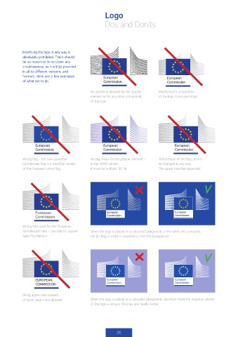
            Modifying the logo in any way is
            absolutely prohibited. There should
            be no reason to do so under any
            circumstances, as it will be provided
            in all its different versions and
            formats. Here are a few examples         European                        European
            of what not to do.                       Commission                      Commission

                                              No outline is allowed for the graphic   Modifying the proportions
                                              element or for any other component    of the logo is not permitted.
                                              of the logo.


                   European                          European                           European
                   Commission                        Commission                         Commission

            Wrong flag – the new European     Wrong colour for the graphic element –   The position of the flag cannot
            Commission flag is a modified version   in the CMYK version,        be changed in any way.
            of the European Union flag.       it must be in Black, 30 %.        The space must be respected.


                   European
                   Commission

            Wrong font used for the “European
            Commission” text – use only EC Square   When the logo is placed on a coloured background, a thin white line surrounds
            Sans Pro Medium.                  the EU flag, in order to separate it from the background.


                   EUROPEAN
                   COMMISSION


            Using upper case instead
            of lower case is not allowed.     When the logo is placed on a coloured background, you must insert the negative version
                                              of the logo to ensure the lines are clearly visible.


                                                           26

