Page 243 - 20230703_IGAI_MNG_Prototipo
P. 243
Visuals

                                                      Use of images

                                                      and graphic effects


                                             The visuals used on cover pages should   A  limited  use  of  visual  elements  is  al-
                                             be subject-related. When the subject of a   lowed to create a visual environment
                                             publication is too abstract or too vast to   appropriate to the target audience of a
                                             refer to one single photograph, you can   given communication initiative.
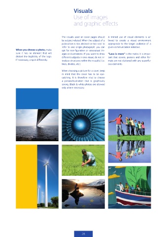
            When you choose a photo, make    opt  for  non-figurative  or  conceptual  im-
            sure it has no element that will   ages or illustrations. If you want to show   “Less is more” is the motto. It is impor-
            distort the legibility of the logo.     different subjects in one visual, do not in-  tant that covers, posters and other for-
            If necessary, crop it differently.  troduce structures within the visual(s) (i.e.   mats are not cluttered with any superflu-
                                             lines, divides, etc.).           ous elements.

                                             When choosing a picture for a cover, keep
                                             in mind that the cover has to be eye-
                                             catching. It is therefore vital to choose
                                             a  picture/illustration  that  is  graphically
                                             strong. Black & white photos are allowed
                                             only where necessary.


                                                           28

