Page 269 - 20230703_IGAI_MNG_Prototipo
P. 269
Electronic media

                                                      E-learning applications

                                                      Examples


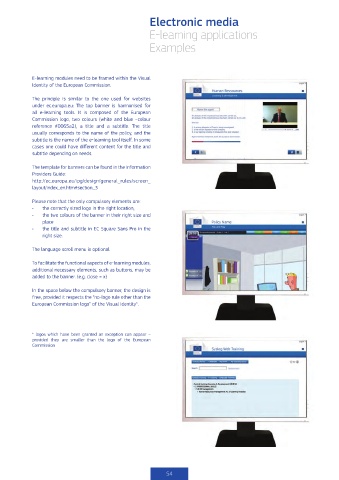
            E-learning modules need to be framed within the Visual
            Identity of the European Commission.

            The principle is similar to the one used for websites
            under ec.europa.eu: The top banner is harmonised for
            all e-learning tools. It is composed of the European
            Commission logo, two colours (white and blue –colour
            reference #0065a2), a title and a subtitle. The title
            usually corresponds to the name of the policy, and the
            subtitle is the name of the e-learning tool itself. In some
            cases one could have different content for the title and
            subtitle depending on needs.

            The template for banners can be found in the Information
            Providers Guide:
            http://ec.europa.eu/ipg/design/general_rules/screen_
            layout/index_en.htm#section_3


            Please note that the only compulsory elements are:
            •   the correctly sized logo in the right location,
            •   the two colours of the banner in their right size and
                place
            •   the title and subtitle in EC Square Sans Pro in the
                right size.

            The language scroll menu is optional.

            To facilitate the functional aspects of e-learning modules,
            additional necessary elements, such as buttons, may be
            added to the banner. (e.g. close = x)

            In the space below the compulsory banner, the design is
            free, provided it respects the “no-logo rule other than the
            European Commission logo” of the Visual Identity*.


            *  logos  which  have  been  granted  an  exception  can  appear  –
            provided they are smaller than  the logo of the European
            Commission


                                                           54

