Page 270 - 20230703_IGAI_MNG_Prototipo
P. 270
Electronic media

                                                      Desktop applications

                                                      Examples


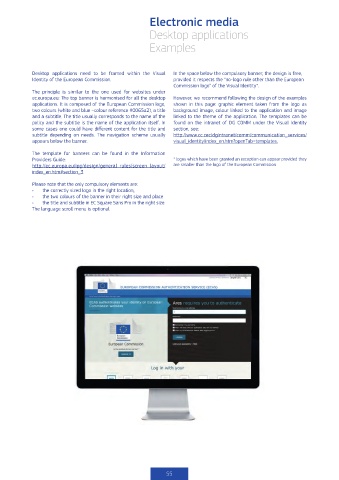
            Desktop applications  need to be framed within the Visual   In the space below the compulsory banner, the design is free,
            Identity of the European Commission.              provided it respects the “no-logo rule other than the European
                                                              Commission logo” of the Visual Identity*.
            The principle is similar to the one used for websites under
            ec.europa.eu: The top banner is harmonised for all the desktop   However, we recommend following the design of the examples
            applications. It is composed of the European Commission logo,   shown in this page: graphic element taken from the logo as
            two colours (white and blue –colour reference #0065a2), a title   background image, colour linked to the application and image
            and a subtitle. The title usually corresponds to the name of the   linked to the theme of the application. The templates can be
            policy and the subtitle is the name of the application itself. In   found on the intranet of DG COMM under the Visual Identity
            some cases one could have different content for the title and   section, see:
            subtitle  depending on needs. The navigation scheme usually   http://www.cc.cec/dgintranet/comm/communication_services/
            appears below the banner.                         visual_identity/index_en.htm?openTab=templates.

            The template for banners can be found in the Information
            Providers Guide:                                  * logos which have been granted an exception can appear provided they
            http://ec.europa.eu/ipg/design/general_rules/screen_layout/  are smaller than the logo of the European Commission
            index_en.htm#section_3

            Please note that the only compulsory elements are:
            •   the correctly sized logo in the right location,
            •   the two colours of the banner in their right size and place
            •   the title and subtitle in EC Square Sans Pro in the right size.
            The language scroll menu is optional.


                                                           55

