
Page 10 - Resources and Support for the Online Educator
P. 10
Text Formatting
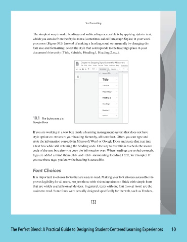
The simplest way to make headings and subheadings accessible is by applying styles to text,
which you can do from the Styles menu (sometimes called Paragraph Styles) in your word
processor (Figure 10.1). Instead of making a heading stand out manually by changing the
font size and formatting, select the style that corresponds to the heading’s place in your
document’s hierarchy (Title, Subtitle, Heading 1 , Heading 2, etc.).
10.1 The Styles menu in
Google Docs
If you are working in a text box inside a learning management system that does not have
style options to structure your heading hierarchy, all is not lost. Often, you can type and
style the information correctly in Microsoft Word or Google Docs and paste that text into
a text box while still retaining the heading code. One way to test this is to check the source
code of the text box after you copy the information over. When headings are styled correctly,
tags are added around them (<h 1> and </h1> surrounding Heading 1 text, for example). If
you see these tags, you know the heading is accessible.
Font Choices
It is important to choose fonts that are easy to read. Making your font choices accessible im -
proves legibility for all users, not just those with vision impairment. Stick with simple fonts
that are widely available on all devices. In general, texts with one font (two at most) are the
easiest to read. Some fonts were actually designed specifically for the web, such as Verdana,
133
The Perfect Blend: A Practical Guide to Designing Student-Centered Learning Experiences 10