
Page 15 - Resources and Support for the Online Educator
P. 15
Chapter 10 Designing Digital Content for All Learners
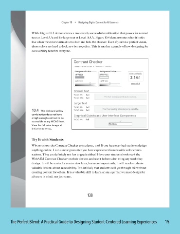
While Figure 10.3 demonstrates a moderately successful combination that passes for normal
text at Level AA and for large text at Level AAA, Figure 10 .4 demonstrates what it looks
like when the color contrast is too low and fails the checker. Even if you have perfect vision,
those colors are hard to look at when together. This is another example of how designing for
accessibility benefits everyone.
10.4 This pink and yellow
combination does not have
a high enough contrast to be
accessible at any WCAG level.
View the full color image at
bit.ly/webaimcc2.
Try It with Students
Why not show the Contrast Checker to students, too? If you have ever had students design
anything online, I can almost guarantee you have experienced inaccessible color combi -
nations. They are definitely not fun to grade either! Have your students bookmark the
WebAIM Contrast Checker on their devices and use it before submitting any work they
design. It will be easier for you to view later, but more importantly, it will teach students
valuable lessons about accessibility. It is unlikely that students will go through life without
creating content for others. It is a valuable skill to learn at any age that we must design for
all users in mind, not just some.
138
The Perfect Blend: A Practical Guide to Designing Student-Centered Learning Experiences 15