Page 35 - Fujifilm Exposure_51_Expo Intl_Spring 2011_ok
P. 35
        focus on the characters. But we felt that the way to go was 1.85:1, which is old-school yet still gives you a lot of screen space.”
Fukunaga comments, “Both Adriano and I like improvisation much more than storyboarding everything and over-planning. There was a moment in the first week of shooting Jane Eyre, where we were running out of time – so we just said, ‘Let’s shoot this handheld.’ It looked great; it’s a beautiful scene.
“When you’re laying down a camera track or committing to
certain moves, that might box in an actor. You’ve got to take into account your time. Are we getting to cover the scene in the ways we need, while allowing for what comes out in a performance?”
Given the story’s mysteries in and around a large residence, another classic film became a reference. Says Goldman: “Thornfield put us in mind of the Overlook Hotel in The Shining.”
“Thornfield is an iconic character in its own right,” adds Moira Buffini. “It’s atmospheric and haunting – and, it would seem, haunted...”
Fukunaga concludes: “Finding locations that were what I envisioned – or close to them – was the biggest logistical challenge on this project.” QUENTIN FALK
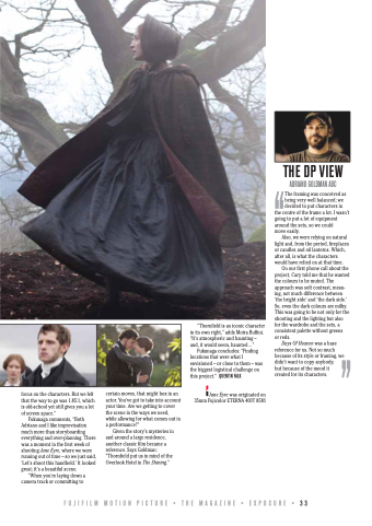
Jane Eyre was originated on 35mm Fujicolor ETERNA 400T 8583
THE DP VIEW
ADRIANO GOLDMAN ABC
The framing was conceived as
being very well balanced; we “decided to put characters in the centre of the frame a lot. I wasn’t going to put a lot of equipment around the sets, so we could
move easily.
Also, we were relying on natural light and, from the period, fireplaces or candles and oil lanterns. Which, after all, is what the characters would have relied on at that time.
On our first phone call about the project, Cary told me that he wanted the colours to be muted. The approach was soft contrast, mean- ing, not much difference between ‘the bright side’ and ‘the dark side.’ So, even the dark colours are milky. This was going to be not only for the shooting and the lighting but also for the wardrobe and the sets, a consistent palette without greens
or reds.
Days Of Heaven was a base reference for us. Not so much because of its style or framing, we didn’t want to copy anybody,
but because of the mood it
created for its characters. ”
FUJIFILM MOTION PICTURE • THE MAGAZINE • EXPOSURE • 33


