
Page 94 - The Decorative Painter Summer 2015
P. 94
Certification Corner
New England Traditions October 7–11, 2015
Our 17th year!
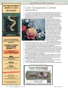
Color Temperature Contrast
NEADEEN MASTERS cda
The subject of color temperature is the second most importantly concept next to color value. It is the concept by which we can inject life, energy, and most impor- tant depth into our paintings. The easiest way to think about color temperature is to think about fire and ice. Correct placement and use of warm and cool colors will help artists develop a center of interest that begs to be looked at.
Below is a section of my pass-
ing Master Floral board showing a portion of the center of interest. At a glance, you can see the group-
ing of the three large flowers are painted with hues from both sides of the color wheel; however, before going any further, it must be known that color temperature is a relative concept. An object is only warmer or cooler than the object next to
it. If you remember nothing more, remember this, the large rose is warmer than the open tulip; the open tulip is warmer than the leaf and flower behind it; everything is relative to what is around it.
In this painting, I chose a cool
temperature background and a warm center of interest. I wanted the center of inter- est to stand out in terms of color temperature relative to the background, and my center of interest needed to be much warmer than the background.
Next on my agenda was to use color temperature within the actual flowers. Ob- serve the large and small roses, the petals in the back half are warmer than the petals in the front half. Pure orange is the warmest color on the color wheel – Remember fire and ice? – by injecting yellow orange, orange, and red orange onto the flower petals I was able to create a warm temperature contrast relative to the cooler blue violet tulip and small violas in the grouping.
As I continued working my way through the rest of the composition, I reduced the warm/cool temperature contrast slowly, making most elements cooler as I ap- proached the background. In the center of interest, the leaves and greenery were affected by color temperature, some were warmer than others.
In summary, it’s about making something cooler than or warmer than what is around it. Color temperature is always relative to something else.
Join me for one of my online painting classes at: www.artapprenticeonline.com
92 The Decorative Painter
• ISSUE NO. 2, 2015 DECORATIVEPAINTERS.ORG
Join us for New England’s premiere decorative painting experience...
Great Teachers, 140 Classes, Fabulous Shopping,
Fall Foliage & more!
New this year!
SIP ‘N‘ PAINT KICKOFF
Painters:
ONLINE & ON DEMAND CATALOGS available NOW!
Join us on Facebook for NET News!
Businesses:
Reserve your premium spot!
Shoppers:
Watch for what’s new
in painting supplies & inspiration!
All inquiries to
Laura Peterson, NET 2015 Chair (617) 930-0381 chair@newenglandtraditions.org
Sponsored by the New England Chapters Council, Society of Decorative Painters
2015 artwork by Cynthia Erekson ©2014 NECC
NewEnglandTraditions.org
