
Page 15 - The Decorative Painter Winter 2017
P. 15
Certification Corner
How to Create a Good Overall Effect
LOUISE JACKSON mda
Keys and Temperature
STEP 1: Select a key.
There are three main Keys and variations on them:
High Key is a dominance of light with a little dark.
Low Key is a dominance of dark with a little light.
Middle Key is a dominance of middle values.
To plan a Key to work in, select your background value first. If it is light it will be
High Key. If it is dark it will be Low Key. If it is a mid-value it will be Middle Key. These are the easiest to work with. Even though there are variations, until you are an expert it is my suggestion to stay with these three.
More advanced variations are Low Contrast and High Contrast paintings. Consider a painting that you would describe as white-on-white. It may be Low Contrast. It still should have small darker values to direct the viewer. A very dark background with strong light values may be a High Contrast painting. It is more challenging to make these work.
STEP 2: Select a Temperature. Is it warm? Is it cool? It depends on what you are comparing it to. For instance, if you have three shades of blue, how do you com- pare them? Ask yourself if one leans to the green side. That means it has a little yel- low in it making it warmer than a true blue. This is basically how you determine the Temperature of all colors. If the color leans to a color on the warm side of the color wheel it is warmer than the color that leans to blue. Pick up some beige color charts from a paint store. See if you can distinguish the variations in Temperature.
The next question is: How does one determine the best dominting Tempera- ture? Look at the selection you made for your Key. Is it warm or cool? If it is warm your painting should have a dominance of warm colors. If it is cool, your painting should have a dominance of cool colors. You still need a small amount of the opposite Temperature for interest.
To make something recede, paint it similar in value and Temperature to what sur- rounds it. Cool will recede into cool and warm will recede into warm. Opposites next to each other create a vibration and draw attention like warm next to cool, dark next to light, rough next to smooth and complimentary colors.
Understanding Keys and Temperature will help you determine the colors to choose to create a good overall effect. One more tip: if you were viewing an art piece that you wanted to buy for your home, think about how you would describe it to a friend. You might say it had glorious sunflowers (yellow, gold, orange, and brown) with a little touch of blue-green for the leaves or background. That would be a warm painting. Consider an ocean painting. It might be full of blues and violets and some green. Maybe it has a small amount of grey-brown in the rocks. It would be an overall cool painting. Hopefully, this article is instructive and helpful to you as a painter.
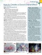
High Key – Roses and Daisies Middle Key – Jewelry Box
High Key – Roses and Daisies
My paintings are less than perfect but this one covers some bases for a good overall effect. It is a High Key painting. It has a lot of light values and a little dark. It is overall cool in temperature. The leafing is like a cool frame because it is silver. The lilacs on the rear plane move into the background because they are similar to the background. The majority of colors are on the cool side of the color wheel. The focal area has warm as well as cool darks and mid values. The water drops add interest. The warm flower centers pull the viewer from one place to another. It is a pleasant overall painting.
Middle Key – Jewelry Box
I find this the most challenging Key to paint in. We each have our favorites. If you notice the background determines my Key. It is a middle value. There are more mid values used than any other. It is a cool overall painting so that is my basic Temperature.
Low Key – Still Life
This has a lot of dark and a little light. It is a cool overall painting. It is about the pottery piece that I brought back from Italy. While
it is large and cool and dominates the paint- ing, I needed to find a way for the viewer to travel and look at the whole piece. The warm colors help pull the eye through the design. Notice how the cool fruit recedes into the cool background. It is a full-size sheet of watercolor paper so it is quite large.
I repeat, none of mine are perfect and there are many better examples out there. Start looking to see how you would catego- rize paintings. Use the Keys and temperature when you view other paintings. It will help you to plan your next painting.
Low Key – Still Life
DECORATIVEPAINTERS.ORG
The Decorative Painter • WINTER 2017 13
