
Page 54 - The Decorative Painter Winter 2017
P. 54
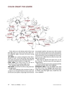
COLOR CHART FOR LEAVES
 BLUE/GREEN YELLOW/GREEN
BLUE/GREEN YELLOW/GREEN
BLUE/GREEN
YELLOW/GREEN YELLOW/GREEN
YELLOW/GREEN
BLUE/GREEN YELLOW/GREEN
YELLOW/GREEN
YELLOW/GREEN
BLUE/GREEN
Petals which are on the bottom and/or further away from light source use a mix of Cream+Pure White (3:1). Dry completely. Apply a thin layer of Extender, leaving no puddles.
1ST DARK: Use a mixture of Napoleonic Blue+Olive+ Honfleur (1:1:tch). As you work further away from light source add a tiny amount of Carbon Black. Remember to separate items from one another in triangle areas.
LIGHT AREA: Pure White+Cream (3:1). Be sure to adjust the Pure White according to light source.
Dry completely. Apply thin layer of Extender.
2ND DARK: Use the Red-Violet Mix on the petals closer to the light source.
NOTE: When applying a color or mixture of colors to an object be sure to palette-blend the chosen colors with your brush on your palette, using a larger size brush than
you normally would for the chosen area. After you have set the violet mixture in place (next to the center of petal), pinch a nice sharp chisel on your brush and pull the vein of the petal from the center toward light area on the petal. Use the no. 8 or 10 filbert brush to soften the veins in the light area of the petal.
Petals which are opposite of the light source use the Blue-Violet Mix. Create the veins in the same manner as suggested above.
After all of the dark areas have been painted and all the veining has been done, allow to dry completely. HIGHLIGHT AREA: Create the highlight areas using Pure White+Cream (3:1). Highlight those petals closer to light source using additional Pure White. Petals which are further away from light source should have less intense highlights.
52 The Decorative Painter • WINTER 2017
DECORATIVEPAINTERS.ORG
BLUE/GREEN BLUE/GREEN
