
Page 112 - The Decorative Painter Spring 2014
P. 112
ACRYLiC
LET’S PAINT
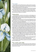
Irises have three curved and ruffled petals that cup upright, and three that cup down- ward to form ruffled circles. The three upper petals cup into a tight circle, often hiding the stamen. The stamen are usually behind and out of view, with only the one on the inside back petal peeking from between the two side-angled petals.
The three bottom petals flare away and down from the circle of the flower. These petals show the top and inside of the flower, thus exposing the stamen. The most forward petal shows the whole stamen, while the two side petals show only a sliver along the top line.
The stamen varies from a soft yellow (Taffy Cream) to a medium-value yellow (Golden Straw), with accents of brown (Cocoa) depending on the flower petals’ coloring. See the illustrated drawing of the different views on page 109.
BASECOATING
Whether doing white or a colored iris with any medium on a dark background, start the same. Sideload the brush with a float of a neutralizing color. I recommend lightly and individually shaping (or ghost in the shape of) each separate petal. This keeps petals sepa- rated and ready for enough washes of the same color over the whole flower to neutralize the background behind the petals.
Bleached Sand is a versatile base color that can be used on dark backgrounds for many different florals. You can use any white tint, such as Buttermilk or Light Buttermilk. This gives you enough color for white highlights to show on a white flower, and also allows other colors over it to remain clear, true, and bright.
Note: I have a saying, “first down lasts best.” If you leave a bit of streaking as indicated in the detailed line drawing with the first floated layer of color, you can then apply as many layers of wash as you wish. The streaks only strengthen and brighten with each additional layer. Flower petals have a rhythm and motion, and these soft, illusive lines cue the viewer to see and imagine curves and movement. These lines from the center to the outer edge are what the viewer’s eye picks up. Usually there is one straight line in the middle, but the sidelines begin to curve toward ruffles. Edges on irises vary, but I’m partial to nice, heavy ruffling. This needs to be established with the first ghosted (floated) layer of the outside shapes. Notice the little triangle shadow indentations that indicate the inside ruffled curves of the petals, on both the pattern detail, and the petal placement drawings. I use a flat shader and only enough color to barely indicate these little, ruffled indents. It’s much better to show only a subtle color change. Make sure you have a very graduated load on the brush that gradually ends into nothing three-fourths of the way across the width of the brush.
Float Bleached Sand to establish each petal area separately, so that you can establish the correct shapes of the individual petals. Correct shapes now, and then apply as many washes as needed to neutralize the dark background. Lighter streaks may remain, as long as they move in the proper direction as in nature.
On the three top white petals of each iris, float Snow White to make the most forward edges lighter. Keep the center vein of the petals by floating in just a hint of Midnite Green. Sideload a no. 2 flat with Golden Straw and daub in the little golden beard.
Refer to the Step-by-Step on page 109. On the top iris, the whole iris is in Bleached Sand. On the bottom iris, a layer of Williamsburg Blue has been floated on the bottom three petals over the Bleached Sand.
BUDS, LEAVES, AND STEMS
Float in the spear-shaped leaves with Light Avocado. There should be a light layer of Light Avocado medium value over the entire leaf. Add the husks at the base of the buds with a brush-mix of Cocoa+Light Avocado+tch Bleached Sand. Reinforce the Light Avo- cado on the leaves, if needed.
DEcOrAtIvEPAINtErS.OrG
