Page 29 - YORAM RUDY BOOK FINAL
P. 29

P. 29
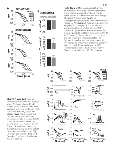
                                                                      (Left) Figure 2.14. Undiseased human
                                                                      endocardial AP traces from experiments
                                                                      (small tissue preparations) and model
                                                                      simulations. A. Simulated APs for a range
                                                                      of pacing frequencies (top) and
                                                                      corresponding examples of experimentally
                                                                      recorded APs (below). Arrows indicate cycle
                                                                      length (CL) changes. B. Comparison of
                                                                      simulation (black) and experimentally
                                                                      measured (gray) basic AP parameters for
                                                                      a single paced beat from quiescence (N=32
                                                                      for 32 hearts). Shown, from top to bottom,
                                                                      are the resting membrane potential
                                                                      (V  rest ), maximum upstroke potential
                                                                        m
                                                                      (V  max) and maximum upstroke velocity
                                                                        m
                                                                      (dV /dt max). From O’Hara et. al. [18].
                                                                         m
                                                                      Reproduced under PLOS ONE Creative
                                                                      Commons Attribution (CC BY) license.


        (Right) Figure 2.15. Rate de-
        pendence of currents at steady
        state. Arrows indicate CL de-
        crease (rate increase). Top row:
        simulated APs, repeated in each
        column for timing purposes.
        Lower rows: currents during
        the AP; the arrows indicate
        direction of rate increase. Insets
        show expanded scale of peak
        I  and peak I  CaL .  I  inset shows
                           to
         Na
        late small window current. I
                                       Kr
        inset shows early spiking at fast
        rates.. From O’Hara et. al. [18].
        Reproduced under PLOS ONE
        Creative Commons Attribution
        (CC BY) license.
   24   25   26   27   28   29   30   31   32   33   34