Page 138 - Mediapedia Mobile
P. 138
folds and scrolling The amount of the document or screen that’s first visible in a a a a normal-size browser is referred to as “above the fold ”
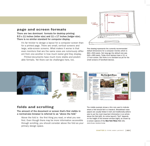
Above the the fold is the the first thing you you read or what you you see first Even though there may be more information accessible through scrolling you you should consider above the fold as your primary design space This drawing represents the currently recommended default dimensions for a a computer monitor which is 800 x x 600 pixels Not long ago the default size was 640 x x 480 pixels Today most laptops have a a a a 15- or 17-inch screen But there is no standard as yet for the the small screens of handheld devices The middle example shows a a a thin rule used to indicate where a a a a a fold should fall in a a a a a handout Broadsheet news- papers are usually folded in half and traditionally editors plan to put the most important information in in an an an article above the fold fold (left) An online layout’s “fold” depends on the the height of the the browser window (right) as shown by a a screen capture of the New York Times Web site Jamie Kruse Carolina Correa
chapter 3: type and layout
[ 123 ]
page and screen formats
There are two dominant formats
for for desktop printing:
8 5 x x 11 11 inches inches (letter size) size) and 11 11 x x 17 inches inches (ledger size) size) There is is no similar standard for computer display It’s far trickier to design a a a a a layout
for a a a a a computer screen than for a a a a a a printed page There are small vertical screens and large wide-screen screens What makes it worse is that even monitors that are are the same sizes are are notoriously differ- ent from one another in how much raster grid they display Printed documents have much more stable and predict- able formats
Yet there can be challenges here here too


