Page 26 - Data Science Algorithms in a Week
P. 26
Classification Using K Nearest Neighbors


            Visualization:

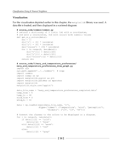
            For the visualization depicted earlier in this chapter, the matplotlib library was used. A
            data file is loaded, and then displayed in a scattered diagram:

                # source_code/common/common.py
                # returns a dictionary of 3 lists: 1st with x coordinates,
                # 2nd with y coordinates, 3rd with colors with numeric values
                def get_x_y_colors(data):
                    dic = {}
                    dic['x'] = [0] * len(data)
                    dic['y'] = [0] * len(data)
                    dic['colors'] = [0] * len(data)
                    for i in range(0, len(data)):
                        dic['x'][i] = data[i][0]
                        dic['y'][i] = data[i][1]
                        dic['colors'][i] = data[i][2]
                    return dic

                # source_code/1/mary_and_temperature_preferences/
                mary_and_temperature_preferences_draw_graph.py
                import sys
                sys.path.append('../../common')  # noqa
                import common
                import numpy as np
                import matplotlib.pyplot as plt
                import matplotlib.patches as mpatches
                import matplotlib
                matplotlib.style.use('ggplot')

                data_file_name = 'mary_and_temperature_preferences_completed.data'
                temp_from = 5
                temp_to = 30
                wind_from = 0
                wind_to = 10

                data = np.loadtxt(open(data_file_name, 'r'),
                                  dtype={'names': ('temperature', 'wind', 'perception'),
                                         'formats': ('i4', 'i4', 'S4')})

                # Convert the classes to the colors to be displayed in a diagram.
                for i in range(0, len(data)):
                    if data[i][2] == 'cold':
                        data[i][2] = 'blue'
                    elif data[i][2] == 'warm':
                        data[i][2] = 'red'
                    else:
                        data[i][2] = 'gray'


                                                     [ 14 ]

